The Fourth Letter
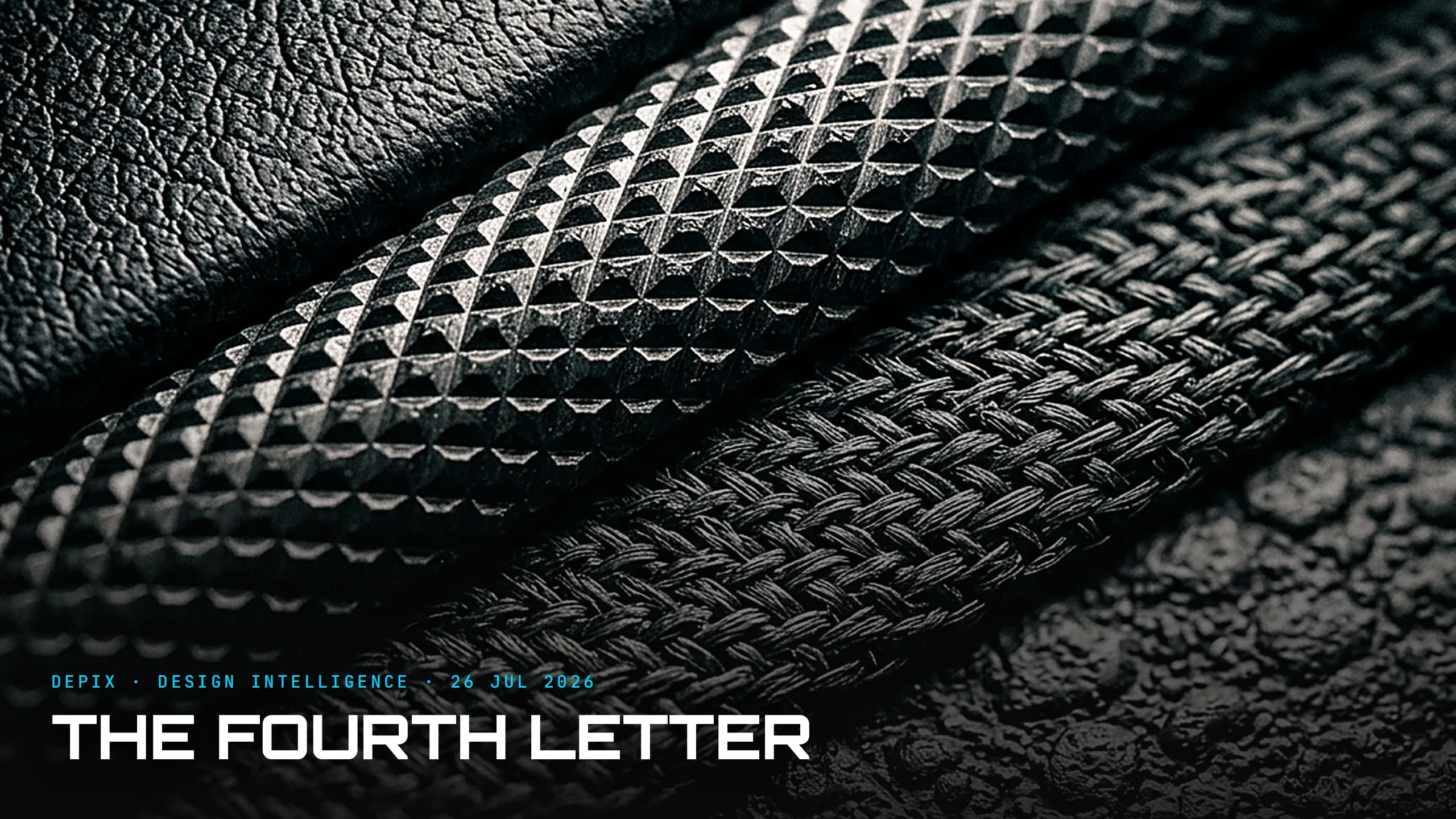
There is a fourth letter designers rarely say out loud. CMF — colour, material, finish — is the language of how a product's surface looks and feels. But the acronym has a silent T on the end: Texture. And texture — the micro-topography your fingertips actually read — is quietly doing more perceptual work than the other three combined.
Here is the demonstration. Take two car door panels: identical colour, identical moulded material, identical satin finish. One feels premium; one feels rental-car. The only difference is the grain — the microscopic pattern pressed into the surface. Your hand knows which is which in a fraction of a second, before your eyes have decided anything. Roughness, microstructure, friction, the contact area between fingertip and surface — these are what the finger actually measures, and they translate directly into "expensive" or "cheap." Colour and material win the first glance; texture wins the first touch, and the first touch is the one people trust.
This matters more now than it ever has. As every cabin migrates to the same slab of black glass and interiors visually converge, visual differentiation is collapsing — so touch is moving to the forefront of CMF. When everything looks the same on a screen, a material has to carry brand identity through the hand. Haptic luxury is the 2026 headline, the Surface Design Show 2026 is effectively a texture show, and premium interiors are being judged on feel as much as look. Touch is becoming the last place a brand can feel different.
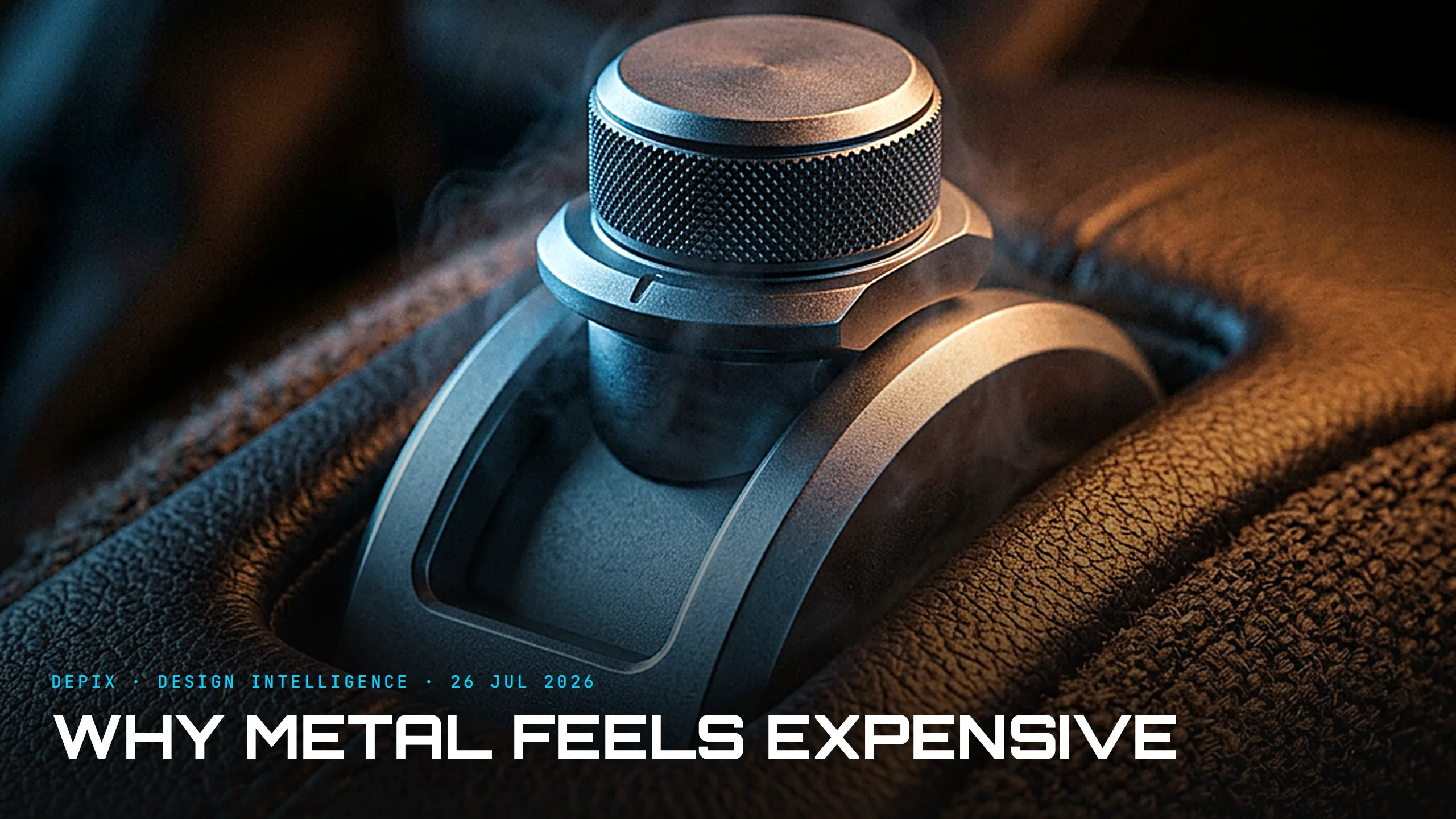
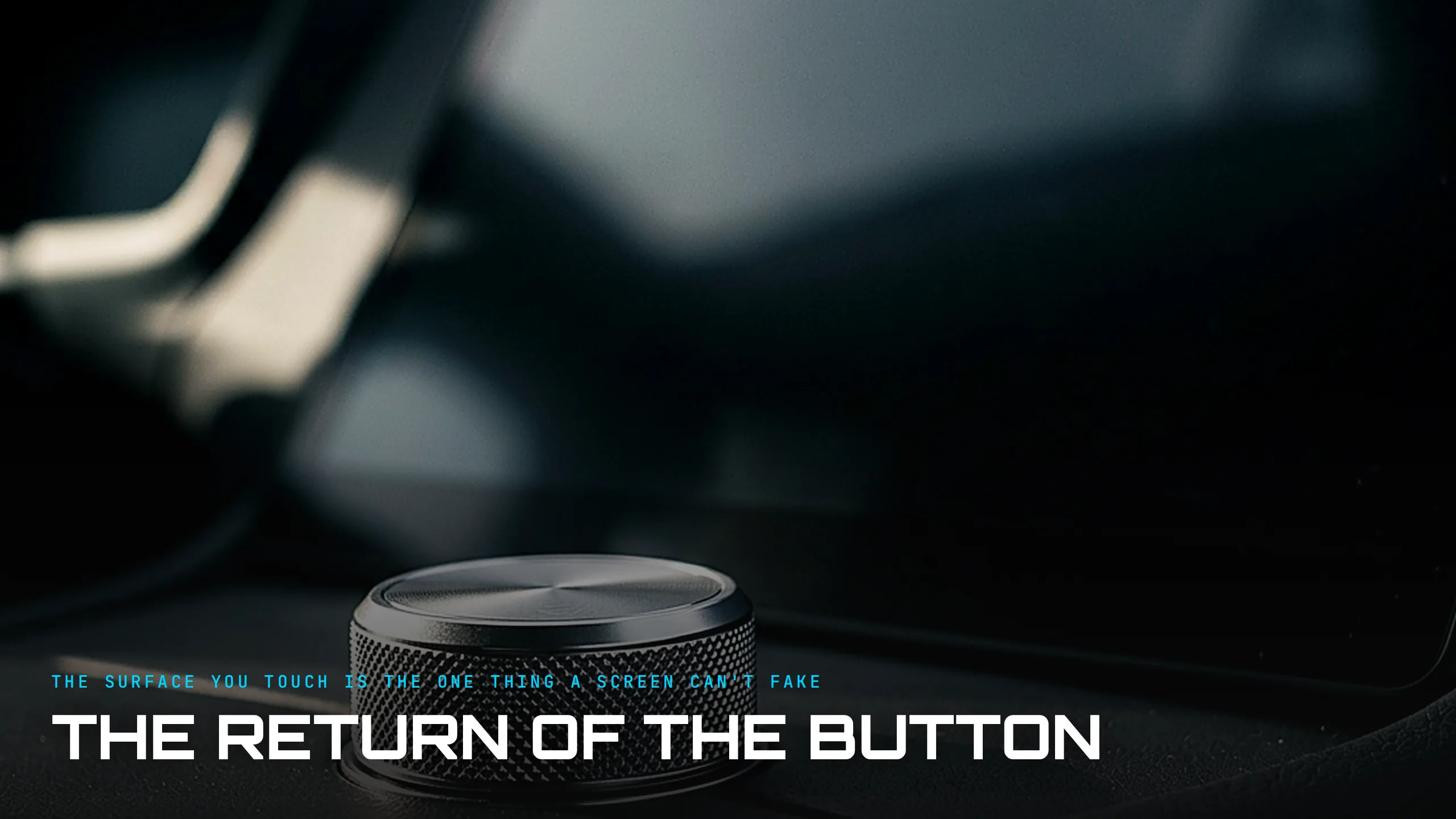
There is a functional edge here too, not just a luxury one. As physical controls return to the cabin — knobs, switches, the rocker you find without looking — texture becomes information. The knurl on a volume dial, the ribbing on a drive-mode toggle, the smooth-to-grippy boundary that tells your thumb exactly where a control begins: these are texture doing the work of a label, read by the hand at speed with the eyes still on the road. A surface that feels uniform is a surface you have to look at to operate. Texture is part of how a cabin lets you keep looking forward — which makes it a safety decision wearing a luxury disguise.
Now the part almost nobody outside the studio knows, and the reason texture is so mishandled: it is not an aesthetic decision made late — it is an engineering decision made at the tool. The grain is etched into the steel of the mould itself, specified against standards like VDI 3400, which grades roughness in microns, or the Mold-Tech leather-and-pebble grain libraries. And choosing the grain is an engineering calculation, not a mood board: it changes cycle time, it changes the demoulding force, and — crucially — it hides defects. A grain conceals the sink marks, flow lines and parting seams that a smooth surface would broadcast. So the texture is doing double duty: it is the premium signal and the thing covering the part's flaws. But it lives in the steel of the mould. Change it and you re-cut or re-buy the tool. Texture is the single most expensive CMF decision to reverse — which is exactly why so many teams lock it in last, as a tooling afterthought, at the precise moment it can least afford to be wrong.
What comes next detaches texture from the steel entirely. Tanvas-style haptic-on-glass modulates an electrostatic field under your fingertip so you can feel the roughness of a knob or the click of a switch on a dead-flat glass screen — texture rendered as software, not tooling. That unlocks something new: tactile branding, where a marque designs its own signature button-feel as deliberately as it designs a signature colour, and can update it over the air. The grain of the future is not pressed into steel; it is drawn under your finger, and it can change.
The concept-phase lesson is uncomfortable. Texture is the axis decided last, treated as a mould-shop detail, and the most expensive to fix — and it is where perceived quality is quietly won or lost, because the hand is a faster and more honest judge than the eye. Colour gets the press release, material gets the sustainability story, finish gets the gloss-versus-matte debate. Texture gets almost nothing, and does the most. Design intelligence is promoting the fourth letter to a first-class decision made at the concept phase — because your customer's fingertips already treat it as one, and they were never fooled by the render.
Sources:
- ●BangID — What Is CMF in Product Design (Colour, Material, Finish)
- ●PMC — A Theoretical Framework of Haptic Processing in Automotive User Interfaces
- ●Car Design News — CMF as strategic expression: softness, haptics and design freedom
- ●SarahZ Designs — Haptic Luxury Interiors 2026: The Psychology of Texture
- ●Finn Interior Designer — Surface Design Show 2026: Materials, Textures & Finishes
- ●CarXplorer — Luxury Car Interiors 2026
- ●Trumax Tools — VDI 3400 Texture Chart: Surface Finishes in Injection Molding
- ●Protolabs — Mold-Tech Textures and Other Finishes for Plastic Parts
- ●Stebro Mold — Choosing the Right Injection Mold Surface Finish: SPI vs VDI vs Mold-Tech
- ●Avtokom — Tactile Branding: Haptic-on-Glass and Electrostatic Friction (Tanvas)
- ●PatSnap Eureka — Haptic Feedback Surfaces in Vehicle Interiors
- ●Hans Ramzan — Industrial Design CMF: A Pro's Guide to Colour & Finish