The Paint That Adds Depth That Isn't There
Matte paint works by killing reflections, so your eye reads a car's form instead of the light bouncing off it. Candy and pearl paints are the exact opposite move — and just as clever. Where matte flattens a surface, these finishes give a flat metal panel a sense of depth that physically isn't there: a colour that seems to sit below the surface, glow from within, and change as you walk past. They are among the most expensive finishes a factory offers, they are close to impossible to repair, and understanding why is a short lesson in the fact that colour is not a flat property.
The trick is that these are not one layer of paint but three. A conventional solid colour is basically a pigment suspended in a clear binder, sitting on the panel like ink on paper. A tri-coat builds the colour in stages: a base coat lays down the underlying hue, a mid-coat carries the special effect, and a clear coat seals and protects it. What lives in that mid-coat is where the magic happens — and it isn't really pigment at all in the usual sense.
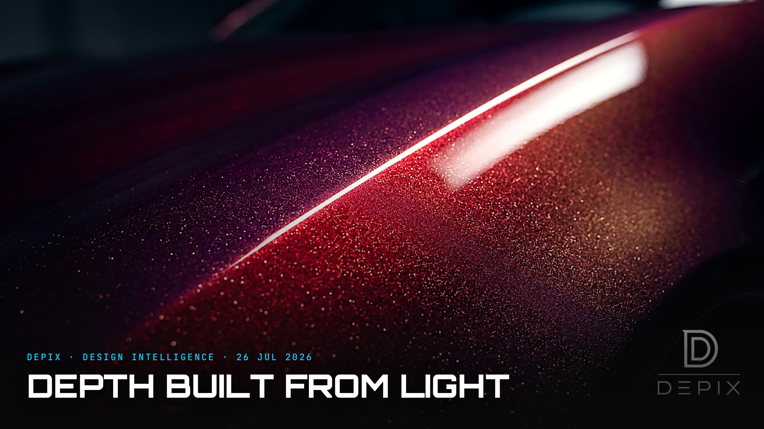
Pearl finishes suspend tiny flakes of mica, a mineral that is translucent and reflective at once. As the paint dries, the flakes settle into roughly parallel layers, like fish scales, and they don't just bounce light back — they refract it, splitting it and letting some pass through to deeper layers before it returns. The result is structural colour: a hue produced not only by pigment absorbing wavelengths but by the physical geometry of stacked, semi-transparent flakes. That's why a pearl shifts as you move — the "flop", or colour travel — and why it looks liquid rather than painted.
Candy goes further still. A candy coat is essentially a transparent tinted lacquer sprayed over a bright metallic base. Light passes straight through the coloured layer, hits the reflective base, and travels back out through the tint again — so you are looking through the colour to a mirror and back, which is what produces that bottomless "hard-candy" glow. The colour you see is not on the surface; it is the sum of light making a round trip through several depths of translucent material. Depth, engineered. It is why a factory pearl or a bespoke candy can add thousands to a car's price for what is, chemically, just a few more coats with a mineral suspended in them — you are paying for a light behaviour, not for a richer material.
All of which is gorgeous, and all of which is why these finishes are a nightmare to fix. Because the colour depends on the orientation and settling of thousands of flakes, the appearance changes with viewing angle, lighting, spray pressure and application distance. Repair a single panel and you are almost guaranteed a mismatch: even with the identical paint code, you cannot reliably reproduce the exact flake alignment of the original, so the patch reads correctly from one angle and visibly wrong from another. Body shops dread it; a scratch that would be a cheap touch-up on a solid colour can mean re-spraying a whole panel or more.
That trade-off is the whole point. Everything that makes candy and pearl feel expensive — depth, movement, the sense of a living colour — comes from building the finish in layers that light travels through, and that same layered construction is exactly what can't be patched. The richness and the fragility are the same property seen from two sides. It is the mirror image of the matte lesson: matte earns its premium by subtraction (no reflections, pure form); candy and pearl earn theirs by addition (translucent depth, colour that moves). Neither is "better"; they are opposite instructions to the eye.
For the concept phase, the lesson is that colour has a third dimension you can design. A hue is not a flat swatch to be chosen at the end from a chart; it can be built with depth, angle-dependence and internal glow, and those qualities read directly as value and life. But depth bought this way is a whole-life commitment — you are choosing a colour that can never be locally repaired, only wholly redone. Decide it at the concept stage, eyes open: the same layers that make the colour feel three-dimensional and alive are the layers that make it, in the end, unrepeatable.
Sources:
- ●Pearl vs Metallic vs Candy: Choosing the Right Finish — UreChem
- ●What Is Pearlescent Paint and How Does It Work? — ScienceInsights
- ●Mica — Wikipedia
- ●Iridescence — Wikipedia
- ●Pearl vs Metallic Car Paint — Autobody Tool Mart
- ●Metallic vs Candy: What Is the Difference? — Carbon Bike Repair
- ●Is Pearlescent Paint Harder to Match? — TouchUpDirect
- ●Why Doesn't My Car Paint Match After Repair? — Barry's Autobody
- ●Lacquer — Wikipedia
- ●Structural coloration — Wikipedia
- ●Pigment — Wikipedia