The Screen Was the Easy Answer
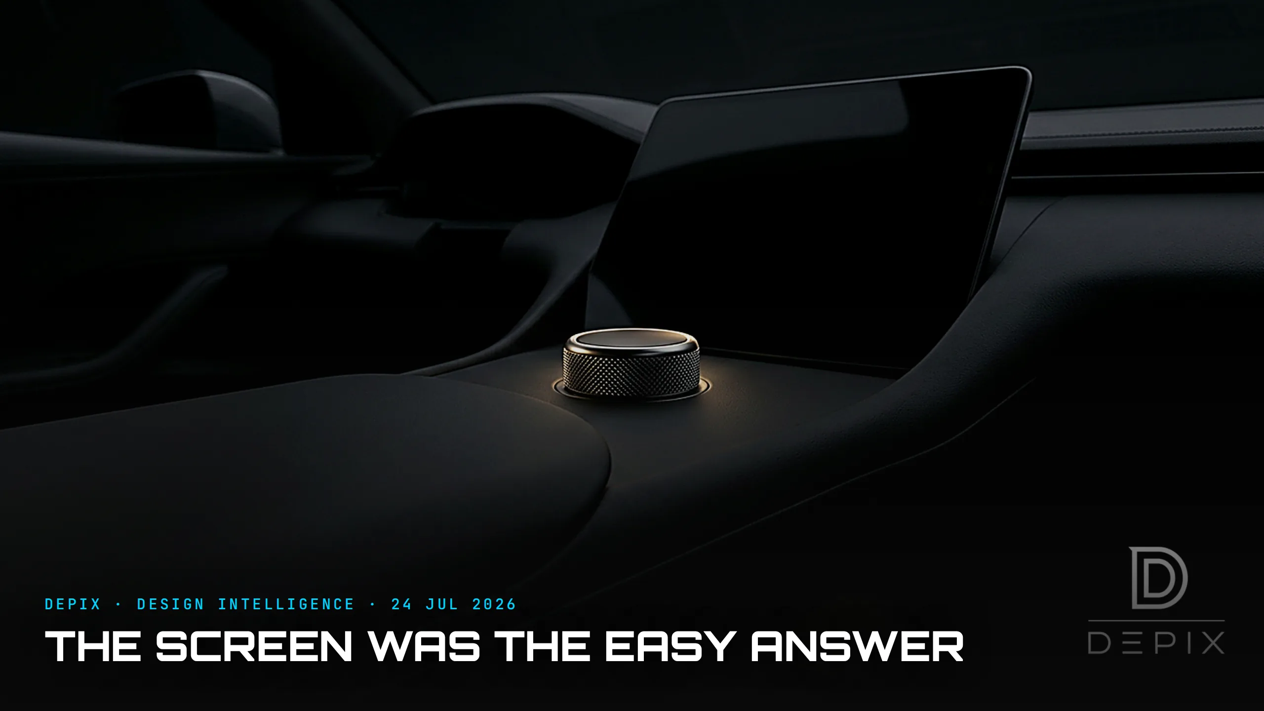
For fifteen years, the interior design review had an easy win: delete the buttons. Every knob, switch and rocker you could migrate into a central touchscreen made the clay look cleaner, the render look newer, and the cabin read - in the language of the pitch - as reductive, architectural, calm. A slab of black glass looks like the future. A panel of thirty buttons looks like 2009. The screen won a thousand design reviews before it ever met a driver.
In 2026 the bill is arriving. From January, Euro NCAP requires physical controls for five core functions - indicators, hazard lights, horn, wipers and the emergency call - before a car can earn five stars. It is not a law, but in a market where the star rating is a marketing weapon, it functions like one. The reasoning is blunt: migrating controls onto screens forces drivers to take their eyes off the road.
The carmakers who leaned hardest into glass are reversing hardest. Volkswagen - which spent six years stripping its cabins down to haptic sliders - has publicly recanted. "We will never, ever make this mistake anymore," design chief Andreas Mindt told the press, confirming that physical controls for volume, temperature, fans and hazards return below the screen on the coming ID.2. "It's not a phone," another VW executive put it, "it's a car." Hyundai never left: design boss Sang Yup Lee calls buttons a safety issue, and the brand has committed to keeping them in its 2026 interiors because a touchscreen, in his words, is just a distraction.
The evidence they are responding to is not subtle. In Swedish magazine Vi Bilagare's test, a driver in a 2005 Volvo V70 completed four basic tasks in ten seconds; the same tasks in a touch-heavy modern car took up to 44.9 seconds - more than four times longer, at motorway speed a difference measured in hundreds of metres travelled effectively blind. Academics now state it plainly: the big screens are dangerous, and buttons are coming back.
Here is the part the safety framing misses. The touchscreen was never really a usability decision. It was a concept-phase shortcut. A physical interface forces a hundred hard, early commitments: what deserves a dedicated control, what its shape says in the dark, where the hand lands without looking, how a knurled dial feels versus a smooth one. Every one of those has to be decided - and defended - while the surfaces are still soft. A screen lets you defer all of it. "We'll sort it in software" is the most seductive sentence in a design review, because it converts a wall of unresolved ergonomic questions into a single clean rectangle that looks resolved. It isn't resolved. It's postponed, and handed downstream to a software team optimising for a spec sheet rather than a thumb.
That is the real lesson for anyone working upstream. The interface hierarchy - what is physical, what is a shortcut, what is buried three menus deep - is a concept-phase decision, not a UI-team cleanup task. It belongs in the same conversation as stance and proportion, because it is just as hard to reverse once the architecture sets. Hyundai did not keep its buttons by adding them back late; it kept them by never treating them as clutter in the first place. And the risk runs both ways - the same brand's newer Elexio SUV shows how quickly a "buttons" promise slides back toward glass when the concept discipline lapses.
The screen was the easy answer because it makes the concept look finished while leaving the actual interface undesigned. At the concept phase, the honest move is the harder one: decide what the hands should be able to do without the eyes, commit to it in physical form, and defend it against the render that always looks cleaner with one less button. The cars that win the next decade will not be the ones with the biggest display. They will be the ones that knew, early, which decisions were too important to hide behind glass.
Sources:
- ●ETSC - Cars will need buttons for a 5-star Euro NCAP rating
- ●S&P Global - Euro NCAP tightens 2026 norms, requires physical buttons
- ●Autoblog - Physical buttons could make a comeback thanks to a new safety regulation
- ●paultan.org - VW: 'we will never, ever make this mistake anymore'
- ●Carscoops - VW brings back physical buttons for volume, heating, fans, hazards
- ●Autoblog - VW: 'It's not a phone, it's a car'
- ●Top Gear - Hyundai's design boss: keeping buttons 'is a safety issue'
- ●Autocar - Hyundai's next-gen 2026 interior, and buttons are staying
- ●InsideEVs - Hyundai bringing back buttons because touchscreens are 'annoying'
- ●The Autopian - Swedish test: buttons less distracting than touchscreens
- ●ETSC - Physical buttons outperform touchscreens in new cars
- ●The Conversation - Yes, those big touchscreens are dangerous and buttons are coming back
- ●Motor1 - Hyundai pledges to keep physical buttons
- ●Motor1 - Hyundai Elexio interior tells a different story

Sameness Is a Choice, Not a Law

Cheap Is the Hard Part: Why the EUR 20,000 Renault Twingo Is the Most Radical Car of 2026