The Icon That Never Advertised
Open any branding textbook and it will give you the rules: trademark your name, spend on advertising, build a social presence, refresh your packaging so it never looks dated, and defend your intellectual property against copycats. Huy Fong Sriracha — the clear bottle with the rooster and the green cap — did the exact opposite of every one of those, and became one of the most recognisable products on the planet.
David Tran, a Vietnamese refugee who fled in 1978 on a freighter called the Huey Fong (which he named the company after), started making his chilli sauce in Los Angeles in 1980. Forty-five years and tens of millions of bottles a year later, Huy Fong has never run an advertisement, keeps almost no social presence, and historically did not even welcome press. It grew, improbably, on word of mouth — chefs putting it on tables, cooks smuggling it into kitchens — into a cult worth over a billion dollars, complete with cookbooks, documentaries and tattoos.
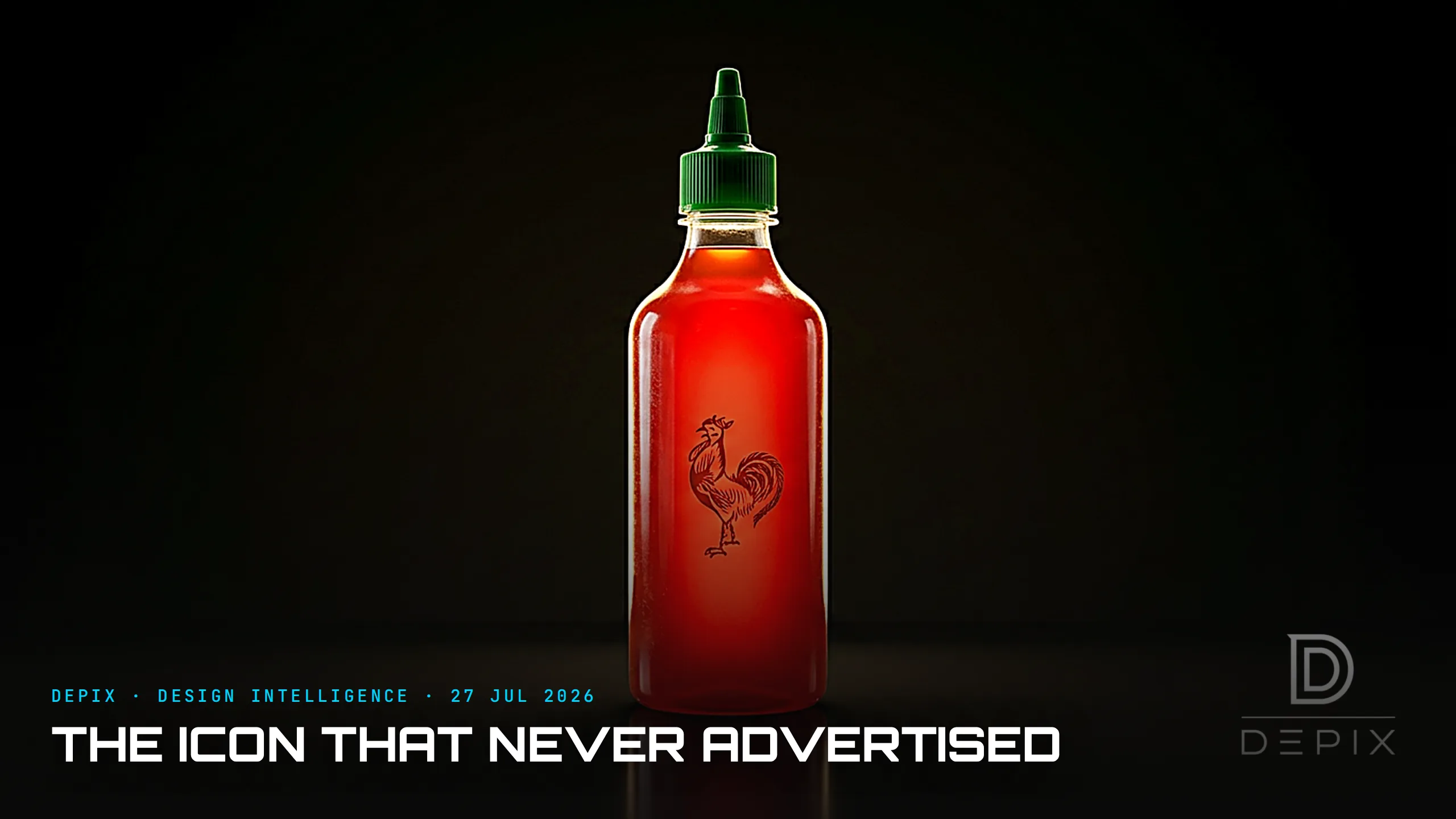
So what did the marketing, if not marketing? The bottle. Look at how much work that package does. It is transparent, so the first thing you see is the actual product — a wall of ripe, glossy red — a small act of radical honesty that says the sauce is the pitch. On the front sits a rooster, Tran's zodiac animal, drawn by an anonymous street artist in 1970s Vietnam whose name Tran never even asked. A green cap. Bold, cheerful, multilingual type. Tran designed the bottle himself, and even the cap earns its place — its green makes the whole thing read like a fat red chilli. It is unmistakable at ten paces and it has not changed in forty-five years.
That last fact is the strategy hiding in plain sight. Every year the bottle stays identical, every sighting compounds the one before it. Recognition is not bought in a campaign; it is accrued through consistency, and consistency is a design decision — specifically, the decision not to redesign. Most brands treat packaging as something to refresh on a cycle, mistaking motion for progress. Huy Fong understood that a mark only becomes iconic if you leave it alone long enough for the world to memorise it. The recognition runs so deep that when a 2024 batch came out a shade off from the usual red, customers spotted it within days and lit up the internet — you cannot register a deviation that small unless the original is burned into your memory.
Then there is the part that makes trademark lawyers wince. "Sriracha" is a generic name — a town in Thailand — and Tran never trademarked it. Which means anyone can, and does, sell a "sriracha": Tabasco, Kikkoman, supermarket own-brands, all of them. On paper that is a catastrophic failure to protect the brand. In practice it barely dented Huy Fong, because Tran was not defending a word — he was defending a rooster and a silhouette. You cannot own the name, but you can own a shape so specific that no imitator's bottle is ever mistaken for yours. Ask someone to name an Asian hot sauce and they will say "sriracha" — and picture the rooster; the brand quietly became the category, like Kleenex or Xerox, without ever owning the word. Distinctiveness turned out to be a stronger moat than protection.
Here is the concept-phase lesson underneath the hot sauce. A distinctive, honest package is the cheapest and most durable marketing a company will ever buy — and it is decided at the very start, at concept, not bolted on afterward by an agency. Huy Fong never needed an ad budget because it front-loaded the entire brand into the object: the clear bottle, the rooster, the cap, the refusal to change. The design was the marketing plan.
We tend to separate these things — first you design the product, then you work out how to sell it. Sriracha collapses the two. The packaging is not a container the marketing department decorates later; it is the single most valuable brand asset the company owns, and it was essentially free. Every dollar a competitor spends re-explaining who they are, Huy Fong saved by making a bottle you only need to see once.
Design teams chase novelty because novelty feels like value and a static design feels like neglect. The rooster is the counter-argument, glowing red on ten million tables: the most powerful thing you can do with a genuinely distinctive design is often to have the nerve never to touch it again — and to trust the object to do the talking everyone else pays for.
Sources:
- ●https://www.thomasnet.com/insights/the-story-of-sriracha/
- ●https://www.sbs.com.au/news/article/who-is-david-tran-the-saucy-billionaire-behind-your-favourite-chilli-sauce/zpcbhl6ko
- ●https://nextshark.com/sriracha-hot-sauce-david-tran-vietnamese
- ●https://www.kqed.org/news/11796231/golden-state-plate-srirachas-journey-from-southeast-asia-to-southern-california
- ●https://www.readtrung.com/p/david-tran-and-srirachas-1b-journey
- ●https://modernfarmer.com/2014/10/heres-story-behind-rooster-sriracha-bottle/
- ●https://www.foxnews.com/us/how-sriracha-got-so-hot
- ●https://www.goodreads.com/author_blog_posts/19108520-the-sriracha-sauce-empire
- ●https://www.thetakeout.com/huy-fong-sriracha-new-taste-grocery-store-return-2024-1851223599/
- ●https://thedieline.com/blog/2022/10/17/here-comes-the-rooster-the-history-of-huy-fongs-sriracha
- ●https://www.categorydesignadvisors.com/category-naming-as-a-brand-sriracha/