The Font in the Wrong Place
No typeface on earth is more mocked than Comic Sans. There are campaigns to ban it, T-shirts that revile it, and a whole cottage industry of designer contempt built on it. But the strange truth is that Comic Sans is not a badly designed font. It is a well-designed font that spent thirty years in the wrong rooms.
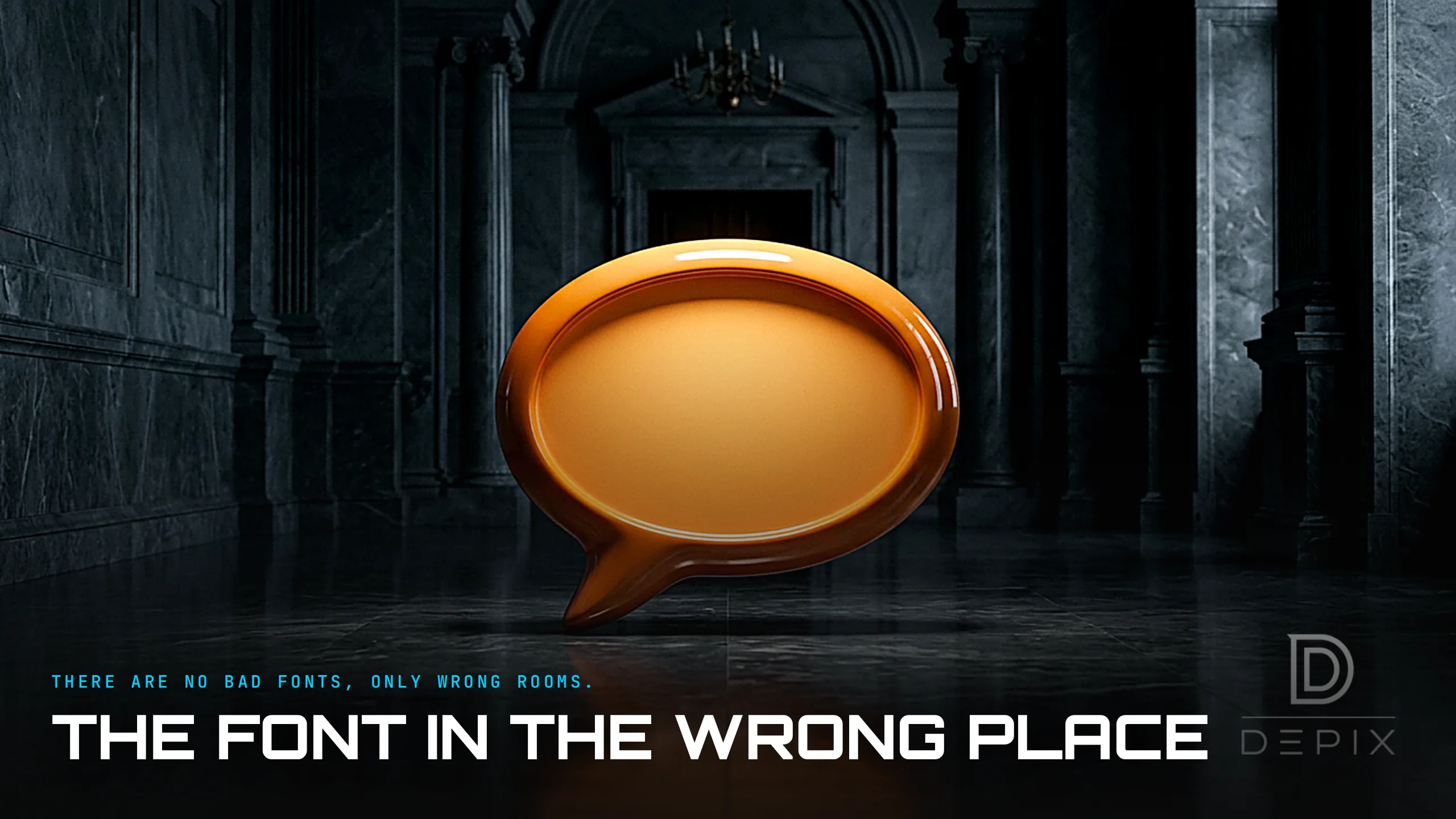
It began with a cartoon dog. In 1994, Microsoft designer Vincent Connare saw a beta of Microsoft Bob - software meant to introduce beginners, especially children, to computers - in which a cartoon dog spoke to users in comic-style speech balloons. The balloons were set in Times New Roman, a formal, serifed newspaper face. Connare thought a cartoon dog should not talk in the font of a broadsheet. So he drew a casual, friendly, non-connecting script inspired by the hand-lettering in the comic books on his desk, The Dark Knight Returns and Watchmen. For that exact job - a cartoon dog's speech bubble in playful software for kids - it was precisely, thoughtfully right.
Then it escaped. Comic Sans shipped free with Windows, on every PC on earth, and it slipped its context. People reached for the "fun" font for birthday invitations, then for church bulletins, then hospital signs, corporate memos, shop windows, and - notoriously - a billionaire's announcement and more than one memorial. A typeface engineered for a dog's speech bubble was suddenly setting the tone for a redundancy notice. The gap between the font's built-in informality and the gravity of where it kept appearing is the entire joke. Comic Sans is not ugly; it is inappropriate - and inappropriateness is a property of a pairing, not of an object.
This is exactly what the mockery misses, and it is worth saying plainly because the disdain became a movement. A typeface is not good or bad in a vacuum. It is good or bad for something: a purpose, an audience, a place. Comic Sans is excellent at what it was made for - warmth, informality, approachability, a comic voice - and hopeless at what it was never made for: authority, formality, seriousness. The font never changed. Only the rooms did. Every one of the thousands of misuses is a context error, not a craft error.
And in some rooms it is not merely acceptable but genuinely better. Its slightly irregular, non-uniform letterforms - the way its b, d, p and q do not simply mirror one another - can make individual characters easier to tell apart, which is why it is frequently recommended in dyslexia-friendly settings and by advocates who work with readers who process text differently. The very quality that offends a graphic designer - that loose, childish looseness - is the quality that helps a struggling reader decode a word. Same font, opposite verdicts, depending entirely on who is reading and why. That is not a flaw in the font; it is the whole point about legibility: it is always legibility for someone.
Here is the design-intelligence lesson, and it reaches far past type. The most common design failure is not bad craft. It is a good object placed in the wrong context. And that failure is decided at the concept stage, in the brief, in the honest answer to a single question: who is this for, and where will it live? Get that answer wrong and the finest craftsmanship in the world will still land as a mistake; get it right and even a humble, unfashionable choice can be exactly what the moment needed. Comic Sans answered its brief beautifully and was then deployed against a thousand briefs it had never been shown. The lesson is not "never use Comic Sans." It is "define the context before you judge the design," because quality is a relationship between an object and its use, not a fixed property the object carries around.
At Depix, this is why we spend our effort at the concept phase, where fit is actually decided. A beautiful design in the wrong context is a failure; a supposedly "bad" one in the right context can be perfect. Before you ask whether a design is good, ask the harder question that Connare answered correctly in 1994 and almost everyone after him got wrong: good for what, and for whom? Connare, for the record, has never apologised - and, understood properly, he has nothing to apologise for.
Sources:
- ●https://en.wikipedia.org/wiki/Comic_Sans
- ●https://en.wikipedia.org/wiki/Vincent_Connare
- ●https://en.wikipedia.org/wiki/Microsoft_Bob
- ●https://www.smithsonianmag.com/arts-culture/comic-sans-the-font-everyone-loves-to-hate-180961052/
- ●https://bancomicsans.com/
- ●https://fontsinuse.com/typefaces/6606/comic-sans
- ●https://www.dyslexiascotland.org.uk/
- ●https://www.understood.org/en/articles/what-is-dyslexia
- ●https://en.wikipedia.org/wiki/Legibility
- ●https://en.wikipedia.org/wiki/Typeface
- ●https://www.cbc.ca/radio/day6/oscar-villains-lynn-beyak-coronavirus-hospitals-weinstein-s-lawyer-the-creator-of-comic-sans-and-more-1.5454398/meet-the-man-who-created-the-comic-sans-font-and-no-he-s-not-sorry-1.5454405