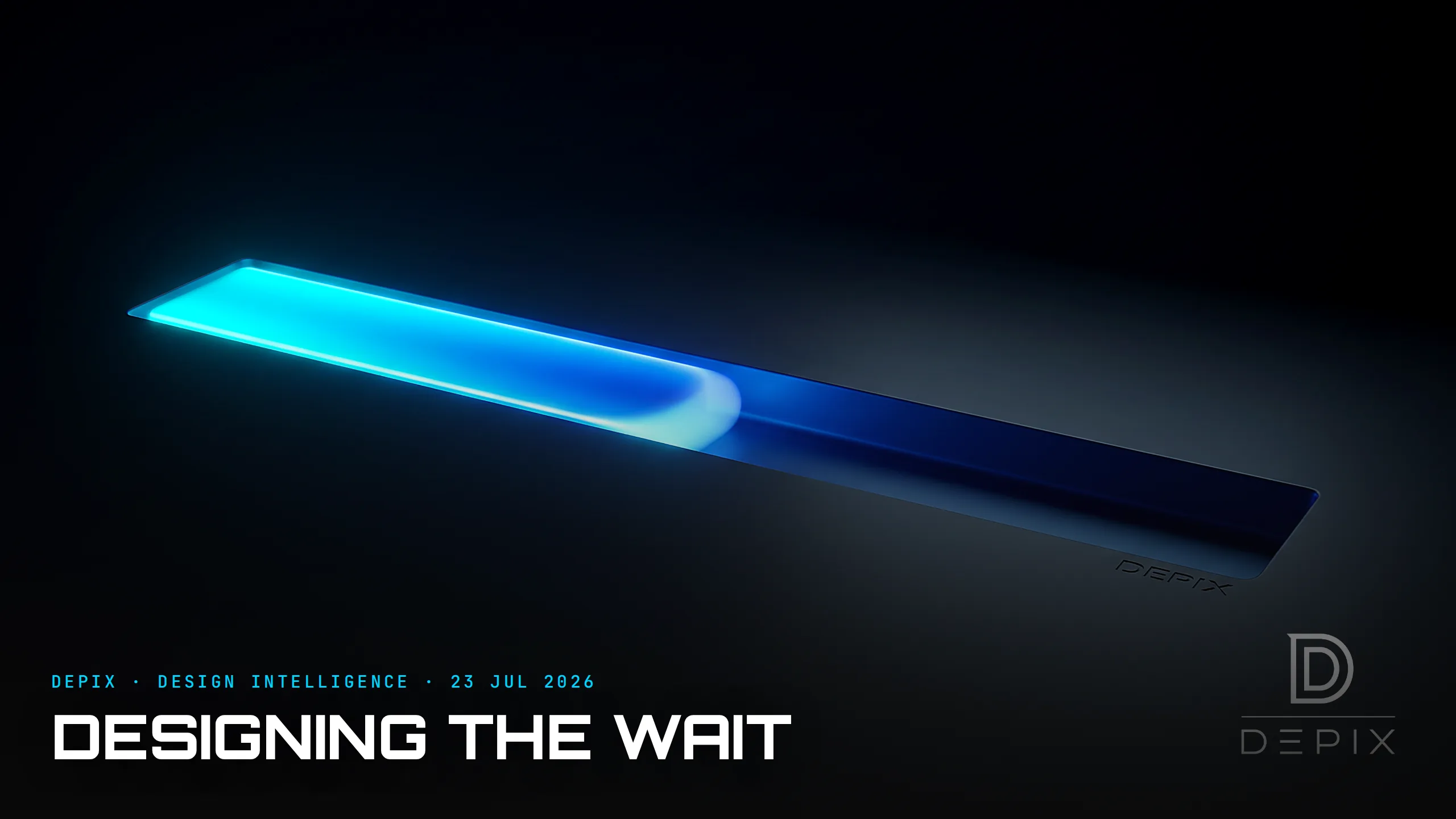
The Progress Bar Isn't About Progress: How Design Shapes the Feeling of Time
Watch a file copy, a page load, a rideshare app find your driver, and you will stare at some version of the same thing: a bar filling, a ring spinning, a car sliding along a map. You assume it is reporting reality — telling you how much is left. Mostly, it isn't. The progress bar's real job was never to measure progress. It is to manage how the wait feels. And feeling, it turns out, is the far more designable quantity.
Start with the strangest finding in the field. Harvard's Ryan Buell and Michael Norton showed that people often prefer a service that makes them wait LONGER — as long as they can see it working. In their flight-search experiments, one group got instant results; another watched a screen narrate the effort ("searching American Airlines… now JetBlue… 133 results so far…"). The group that waited and saw the work reported higher perceived quality, higher willingness to pay, and more desire to return. They called it the labor illusion: visible effort reads as value, even when the instant version is identical.
Simply showing a progress bar transforms tolerance. In one study, people watching a bar were willing to wait a median of 22.6 seconds — more than double the 9 seconds tolerated with no visible progress at all. Nothing about the underlying speed changed. The feedback did.
And the details of that feedback bend time. We judge duration by the motion of the bar, so its animation curve matters: a bar that moves briskly and eases at the end tends to feel faster than one crawling at a constant pace. Skeleton screens — the grey placeholder shapes that appear before content beat spinners because a spinner communicates only uncertainty, while a skeleton implies the page is already arriving. A spinner turns waiting into passive helplessness; a skeleton turns it into active anticipation — and active waits always feel shorter than passive ones.
None of this is trickery for its own sake — and here is the line good designers do not cross. A progress indicator must stay tethered to something real. The moment a fake one visibly loops, freezes, or lies, the illusion collapses and takes your credibility with it. Perceived-time design isn't about faking speed; it is about honestly shaping how an unavoidable wait is experienced.
Which is the design-intelligence point. There are two clocks in every product: the real one, measured in milliseconds, and the felt one, measured in patience. Engineering optimises the first — and it should. But the second is often the one the user actually lives in, and it answers to a completely different set of levers: visibility, motion, narration, the difference between watching a machine work and staring into a void. Teams that chase only real latency are polishing the clock the user half-notices while ignoring the one they feel.
And the felt clock is designed at the concept phase or not at all. "How does this system behave while it makes someone wait?" sounds like a loading-screen detail and is actually a core experience decision — it shapes trust, perceived quality, even willingness to pay. Left to the end, it becomes a default spinner an engineer dropped in because something had to spin. Decided at the start, it becomes a deliberate piece of the product's character: the reassuring narration, the honest skeleton, the animation tuned to feel like momentum.
So the next time you design something that makes a person wait — and everything makes someone wait — remember you are not just building the process. You are authoring the experience of time itself. The bar is rarely telling the truth about progress. Its job is to tell a kinder truth about the wait — and choosing which truth to tell is design, made at the beginning, on purpose.
Sources:
- ●The Labor Illusion: how operational transparency increases perceived value — Harvard Business School
- ●The Labor Illusion — Management Science (INFORMS)
- ●Labor Illusion: why brands should show their work — Forbes
- ●Designing better loading & progress UX (22.6s vs 9s) — Smart Interface Design Patterns
- ●Evaluating time perception of progress bars (Bayesian model) — arXiv
- ●Skeleton screens vs progress bars vs spinners — Nielsen Norman Group
- ●Skeleton screens vs loading spinners — Onething Design
- ●What you should know about skeleton screens — UX Collective
- ●The psychology of waiting in UX — Design Bootcamp
- ●UX design patterns for loading feedback — Pencil & Paper
- ●Effective skeleton screens — Tim Kadlec
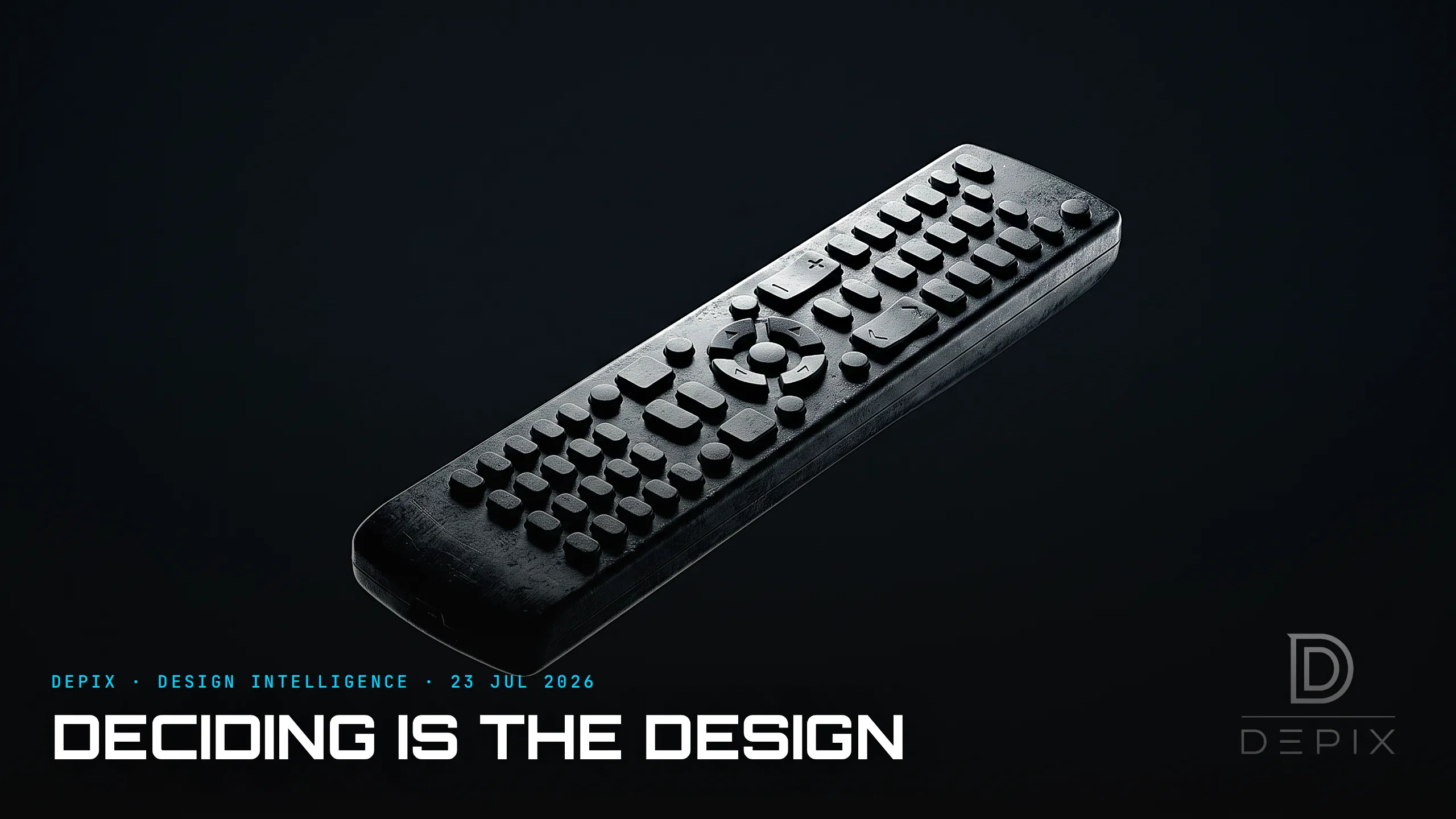
The Remote Control Is a Monument to Not Deciding: The Real Discipline Is Editing
Design Intelligence Daily — The Decision Is Always Upstream (23 July 2026)