Should Your Font Disappear?
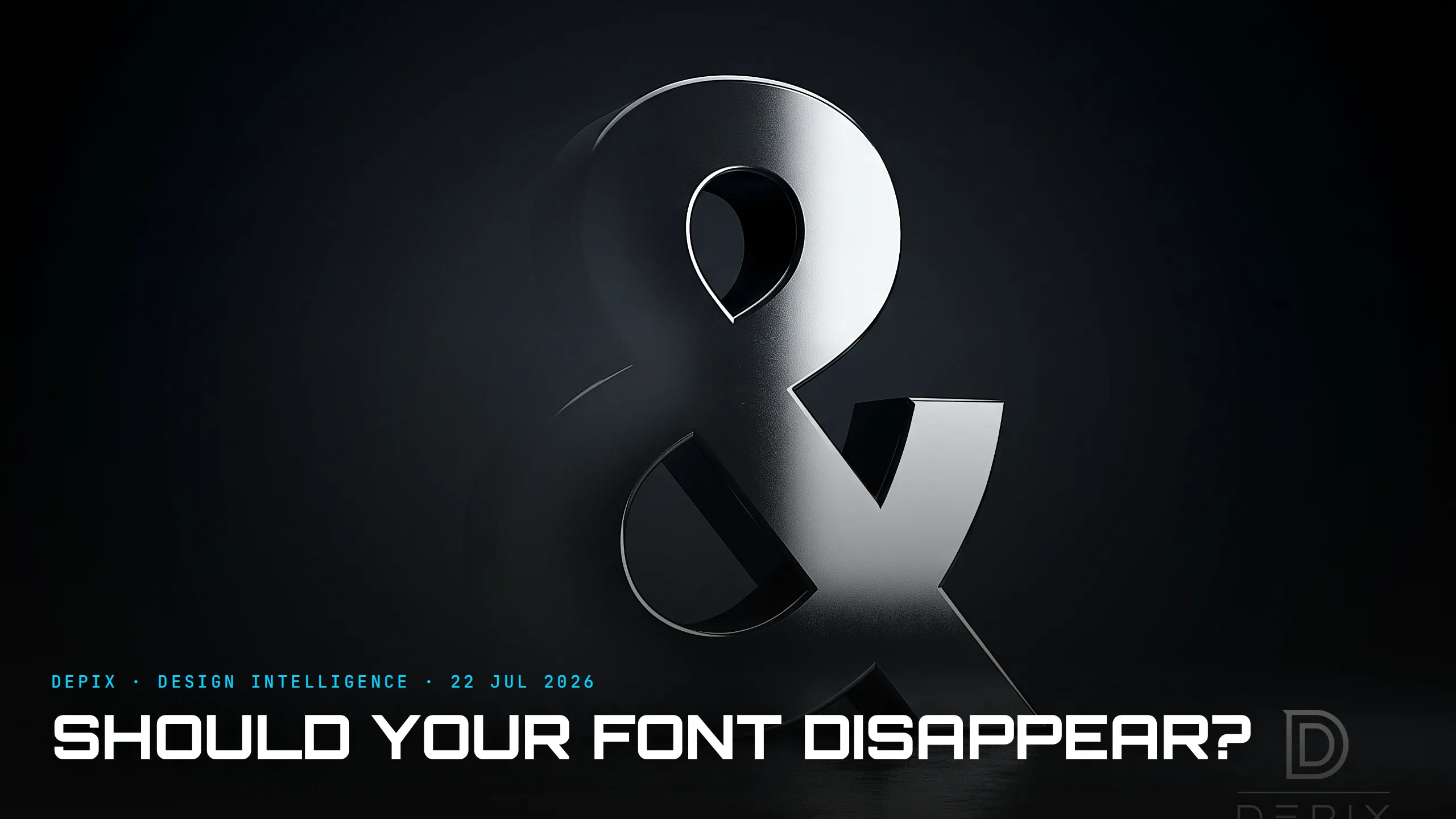
A typeface is the first thing a brand says, before a single word is read. It sets the tone, the era, the confidence, the voice — instantly and subliminally. And for about a decade, nearly every brand made the same choice: a clean, neutral, geometric sans-serif that gets out of the way. The result was "blanding" — a wave of identities so similar you couldn't tell a bank from a startup from a museum. 2026 is the correction. The design world is moving past rigid minimalism into expressive modernism, and the central typography decision has sharpened into a fork: should your typeface disappear, or should it have a point of view?
Both directions are legitimate. On one side, neutral, reliable grotesques that get out of the way — maximal legibility, no opinion, the type equivalent of a white gallery wall. On the other, a growing appetite for typefaces with genuine personality — character, cultural weight, a voice. The mistake of the last decade wasn't choosing the neutral option. It was choosing it by default, without deciding, because neutral felt safe. And safe, at scale, became invisible.
Here is the design-intelligence point. The typeface is one of the earliest, cheapest and most permanent identity decisions a brand makes — and it is made at the concept phase. It runs through everything: the logo, the app, the packaging, the signage, the fine print. Change it later and you are not editing a logo, you are re-setting every word the brand has ever published. Which is exactly why choosing it by default is so costly: you inherit a voice you never actually decided on, and you inherit it everywhere, for years.
Wayfinding makes the stakes literal. A signage typeface like Frutiger was engineered for one job — clarity at distance and speed — and getting it wrong doesn't just look bad, it means someone misses a turn. That is the extreme end of "disappear": type whose entire success is measured by how little you notice it. But most brands are not an airport concourse. For them, a typeface that disappears isn't neutral — it is an abdication of the single most pervasive tool they have to sound like themselves.
The honest answer, then, is that neither pole is "right" — it depends on what the type has to do. A utility you use under stress — a transit map, a tax form, a dashboard — should mostly disappear; a brand whose whole value is taste, culture or a point of view is throwing away its loudest asset if it does the same. The failure is not picking the wrong pole. It is not noticing there was a question, and letting the safest option quietly answer it for you.
The 2026 releases show the market pricing this in. New typefaces are born with digital-first functionality — variable axes that flex from quiet to loud, kinetic potential built in — so a brand no longer has to pick "disappears" or "has a voice" once and forever; the same family can do both, dialled by context. The best new sans-serifs are being deliberately injected with warmth and distinctive detail — grotesques that stay legible but stop being anonymous. Even the workhorse families global brands standardised on are now chosen for a specific character, not merely for getting out of the way — a shift you can watch release by release.
The deeper lesson generalises well past type. Every product has a "typeface decision" — a foundational, early, near-invisible choice that quietly sets the tone for everything built on top of it, and that teams are tempted to make by defaulting to the safe, neutral option. The default feels responsible. But defaulting is still a decision, just an unowned one, and its cost is that you end up sounding exactly like everyone else who also defaulted. Helvetica is a masterpiece; a world where every brand uses it is a world with no brands.
So the concept-phase question isn't "which font looks nice?" It is the harder one underneath: do we want this to disappear, or do we want it to have a voice — and are we deciding that on purpose? Rebranding is expensive precisely because type is so load-bearing; the moment to get it right is before it is woven through everything, while it is still just a choice on a page. Neutral is a perfectly good answer. "We never actually chose" is not.
Sources:
- ●PRINT Magazine — 2026 Type Report
- ●Creative Boom — Top 50 fonts in 2026
- ●Brandlic — 15 typefaces designers are reaching for in 2026
- ●Creative Boom — The best new typefaces for June 2026
- ●Brandlic — February 2026: the latest typography releases
- ●Creative Boom — The best new typefaces for May 2026
- ●We and the Color — The 100 coolest fonts for designers in 2026
- ●Wikipedia — Typeface
- ●Wikipedia — Sans-serif
- ●Wikipedia — Helvetica
- ●Wikipedia — Frutiger (typeface))
- ●Wikipedia — Legibility
- ●Wikipedia — Rebranding