The Shape Is the Brand
In March 2023, one of the most recognisable chocolate bars on earth quietly removed a mountain from its box. Because Toblerone had shifted some production out of Switzerland, strict national "Swissness" rules meant it could no longer show the Matterhorn on its packaging, and the famous peak was swapped for a generic mountain. It made headlines - and it changed nothing about whether you could recognise the product. Because the Matterhorn was never the brand. The shape was.
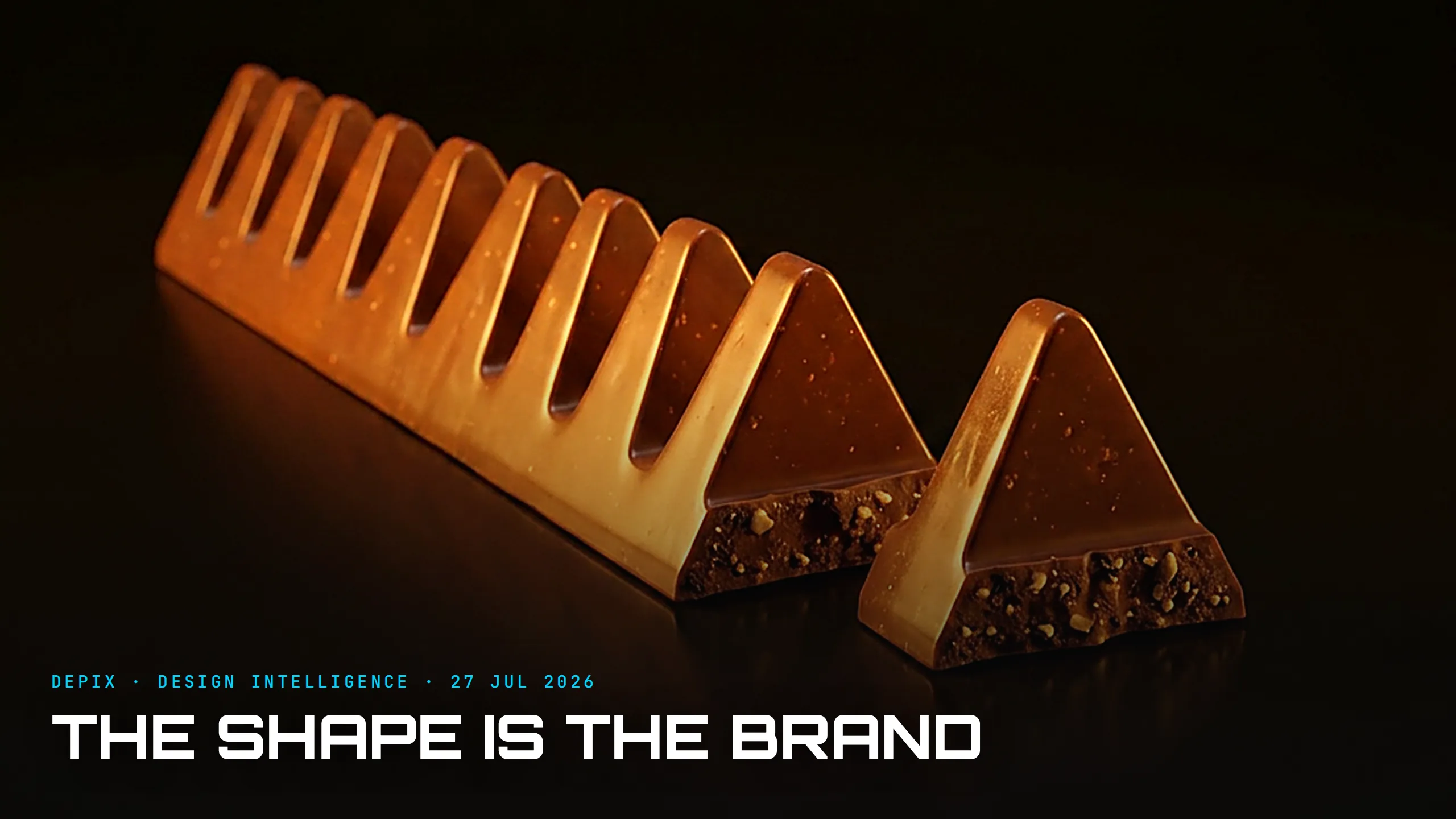
Toblerone was created in 1908 in Bern by Theodor Tobler, with his cousin Emil Baumann developing the recipe - milk chocolate with nougat, almonds and honey - and Tobler contributing the two things that would outlive everything else: the name, a portmanteau of "Tobler" and the Italian nougat "torrone," and that unmistakable row of triangular peaks. In 1909 he patented the process and registered the design, among the earliest chocolate makers to treat a shape as intellectual property.
Where the triangle came from is a small, revealing mystery. The tidy story is the Matterhorn, Switzerland's iconic peak. But Tobler's own sons said the real inspiration was the Folies Bergere in Paris, where dancers ended their show by forming a human pyramid. Mountain or showgirls, the point is the same: Tobler chose a form first and let the meaning attach afterwards. The shape did not illustrate the brand; it became it.
Here is what makes the decision brilliant, and slightly mad. The triangular prism is, by any practical measure, a bad shape for a chocolate bar. It does not tessellate, so it wastes space in a box and on a shelf. Its points get crushed. And almost everyone eats it "wrong" - the segments are designed to be snapped by pushing a piece inward, toward the spine of the bar, not pulled outward, which is how most people nearly break a tooth. A sensible designer optimising for packing, shipping and ease of eating would have drawn a flat rectangle and produced something no one would remember. The impracticality is the distinctiveness.
And distinctiveness of form turns out to be the most durable brand asset there is. A name can be imitated, a recipe reverse-engineered, a logo legally challenged - as the Matterhorn just was. But a silhouette lodges in memory in a way words and pictures do not. You know a Toblerone in the dark, from across a room, broken into loose triangles with the box long gone. That recognisability is protectable, too: the three-dimensional shape can function as trade dress, a form of trademark that guards the look of a product itself, not just its label. Toblerone even hid a bear in the Matterhorn - a nod to Bern, the city of bears - but the bar never needed the joke to be known.
The 2023 episode proved the hierarchy in real time. Losing the right to the Matterhorn was treated as a crisis of identity, and the redesign drew plenty of complaints - but the object itself never wavered. On the shelf, in a lunchbox, half-eaten, it was still unmistakably a Toblerone, because the peaks do the work the mountain only illustrated. A logo is read; a shape is simply recognised, faster than language, at any size, even damaged. Toblerone had two Swiss mountains going for it, and only the edible one was ever irreplaceable.
This is the concept-phase lesson, and it reaches far past confectionery. The silhouette of a thing is not a styling flourish added at the end; it is a strategic, defensible asset decided at the very beginning. Most products are shaped by the path of least resistance - the cheapest mould, the most stackable box, the most obvious rectangle - and end up visually anonymous, leaning on a logo to say who they are. A distinctive form does the opposite: it carries the identity in the object itself, so the brand survives a moved factory, a changed logo, even a stripped-away mountain.
At Depix, we treat the concept phase as the moment this is won or lost. The most valuable question is rarely "what is the most practical shape?" It is "what is the shape only we could own?" A century after Theodor Tobler drew a line of little peaks, the answer is still sitting on every checkout counter, instantly recognisable, mountain or no mountain. The form was the brand all along.
Sources:
- ●https://en.wikipedia.org/wiki/Toblerone
- ●https://www.euronews.com/culture/2023/03/06/toblerone-to-lose-the-matterhorn-logo-as-the-chocolate-can-no-longer-be-considered-swiss
- ●https://en.wikipedia.org/wiki/Matterhorn
- ●https://en.wikipedia.org/wiki/Theodor_Tobler
- ●https://www.historytools.org/resources/matterhorn-of-chocolate-theodor-toblers-toblerone-story
- ●https://www.historyoasis.com/post/theodor-tobler
- ●https://www.hatchwise.com/resources/the-history-of-the-toblerone-logo
- ●https://www.yahoo.com/lifestyle/articles/fascinating-reason-toblerone-chocolate-bars-222500630.html
- ●https://www.mashed.com/199005/the-untold-truth-of-toblerone/
- ●https://www.cadburydessertscorner.com/articles/toblerone-trivia-fun-facts-and-history-of-the-classic-chocolate-triangle
- ●https://en.wikipedia.org/wiki/Trade_dress
- ●https://switzerlanding.com/toblerone-history-logo-matterhorn/