The Anti-Office Typewriter
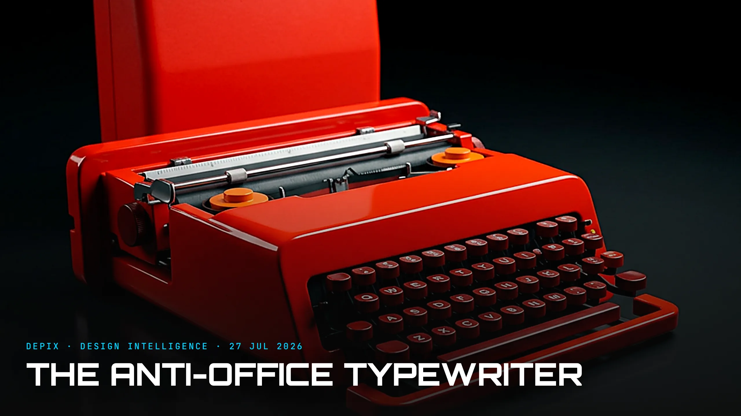
Every typewriter before 1969 agreed on one thing: it belonged in an office. It was heavy, grey or black, sober and mechanical - a serious tool for serious work, styled to disappear into the furniture of labour. Then Olivetti shipped a bright red plastic portable pointed in exactly the opposite direction. The Valentine, designed by Ettore Sottsass with the young British designer Perry A. King, was not a better office typewriter. It was a deliberate refusal to be one.
Sottsass said it out loud. The Valentine, he explained, was "invented for use in any place except an office, so as not to remind anyone of the monotonous working hours, but rather to keep amateur poets company on quiet Sundays in the country". Read that as a design brief and notice what is strange about it: it is defined almost entirely by what the object should NOT be. Most briefs are a list of things to add - faster, lighter, more features. Sottsass started from a subtraction. He looked at the whole category, named its governing assumption - a typewriter is office equipment - and designed that assumption out.
The result, launched on Valentine's Day 1969, was what Olivetti's own people called an "anti-machine machine": a working typewriter with a humanised, almost emotional presence. Injection-moulded in cheerful red ABS plastic - body and carrying case both - it had a handle so you could sling it like a bag, and it was tuned to Pop Art rather than to the office. Sottsass took the vivid palette of 1960s Pop as licence for its accents. It was meant to sit on a table in a small apartment, to travel, to be wanted. It entered the permanent collections of MoMA, the Metropolitan Museum of Art and SFMOMA - a cheap object of injection moulding treated as a landmark of twentieth-century design.
Here is the concept-phase lesson, and it is not "use bright colours." It is that positioning - what an object is FOR, who it is for, how it should make you feel - is a decision made at the very start, encoded into form and colour and material, not a message bolted on by marketing afterwards. Underneath, the Valentine was a fairly ordinary portable; Sottsass did not reinvent the mechanism. What he changed was its argument. The redness, the plastic, the handle and the name all say the same thing before you type a word: this is not work, this is pleasure. That coherence - every attribute carrying one intent - is exactly what a concept phase is supposed to produce, and it is far harder than adding features.
But the Valentine is also a warning, and Sottsass was the one who issued it. He came to distrust his own hit. He later dismissed it as "too obvious, like a girl wearing a very short skirt and too much make-up" - a rebellion that had been too easy, too skin-deep. Commercially the Valentine underdelivered, too: expensive for what it was, its bright plastic reading to some buyers as cheap rather than joyful. The gesture lived mostly on the surface - a colour and a shell - while the object beneath still behaved like every other typewriter.
That tension is the real story. Twelve years later Sottsass took the Valentine's instinct - reject the sober "good taste" of modernism - and drove it far deeper with the Memphis Group, whose garish, playful, deliberately "wrong" furniture was a full assault on the Bauhaus demand that form follow function. The Valentine was the seed of decades of postmodern design: the idea that an object can hold a point of view, an attitude, even a joke - that it can argue with its own category.
At Depix, we read the Valentine as two lessons held together. First: deciding what a thing refuses to be is as generative as deciding what it does - the sharpest concept work often begins by naming a category's default and rejecting it. Second, drawn from Sottsass's own regret: a rebellion that is only a colour is a costume. The anti-category moves that last are the ones that change how the object behaves, not just how it looks. The Valentine earned its place in the museum on attitude alone. The harder, better brief is to make the attitude go all the way down.
Sources:
- ●https://en.wikipedia.org/wiki/Olivetti_Valentine
- ●https://en.wikipedia.org/wiki/Ettore_Sottsass
- ●https://digitalcommons.risd.edu/risdmuseum_channel/36/
- ●https://www.cooperhewitt.org/2013/06/23/weekends-with-my-valentine/
- ●https://www.domusweb.it/en/from-the-archive/2011/08/25/red-valentine.html
- ●https://www.moma.org/collection/works/4576
- ●https://www.frieze.com/article/not-love-song
- ●https://www.metmuseum.org/art/collection/search/739409
- ●https://www.sfmoma.org/artwork/2004.185.A-B/
- ●https://www.iconeye.com/opinion/review-ettore-sottsass-design-radical
- ●https://en.wikipedia.org/wiki/Memphis_Group
- ●https://wearethemutants.com/2018/09/20/no-powerful-idea-lasts-long-the-memphis-group-and-the-1980s-look/