The Shadow Test: Why the Best Designs Survive as a Pure Black Shape
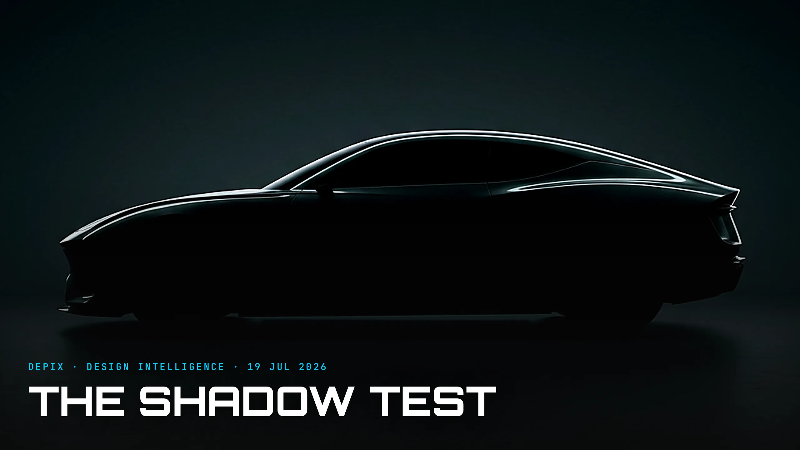
There is a test that separates the designs that endure from the ones that merely look nice, and it is brutally simple: fill the shape in solid black and see if you still know what it is. Designers call it the silhouette test — reduce a design to a monochrome outline and study it, because if it survives as a pure shape it will survive anywhere. Most logos fail it. Most cars fail it too. And the ones that pass are working on the deepest, most durable layer of identity there is.
We tend to think we recognise a car by its badge, its grille, its lighting signature. That is not how the eye actually works. Before you read a badge or catch a logo, you already know what you are looking at — from the silhouette, the stance, the proportion. Those cues land first, pre-attentively, at a distance and in a mirror, long before any detail resolves. A grille is something you read up close; a silhouette is something you recognise across a car park. The detail is the last layer of identity. The shape is the first.
The definitive proof is the Porsche 911. Sixty years on, its outline — the unbroken curve falling from roof to tail, the round lamps, the rear-biased mass — is instantly recognisable as a black shape with every badge removed. Porsche has changed almost everything under that shape across generations while keeping the silhouette sacrosanct, because it understood that the shape is the brand. People buy a new 911 substantially because of that profile; it is arguably the most valuable single line in the car industry.
Here is why this belongs to the concept phase and nowhere else. A silhouette is not styled on — it is the sum of the earliest, hardest decisions: where the wheels sit, how tall the greenhouse is, where the cabin falls between the axles, how the roofline runs. Those are proportion and stance, locked by the platform and the hardpoints before a single surface is sculpted or a headlight drawn — which is exactly why studios still build full-size clay models to judge the shape in the round. You cannot detail your way to a great silhouette any more than you can rescue bad proportions with a nice grille. Get the shape right in the first clay and everything after it has a foundation; get it wrong and no amount of jewellery saves it. Tellingly, when you ask even an AI to draw a sports car, it reaches for the profile — because the side view is where a car's character actually lives.
And the silhouette test is about to get far more important, because everything else that used to carry identity is disappearing. Grilles are closing as engines go electric; chrome is being deleted; badges are flattening into interchangeable minimal marks; even lighting signatures are converging. As each of those detail-layers fades or homogenises, the silhouette is left standing as the last thing a brand truly owns. A marque that built its recognisability on a big chrome grille is in trouble; a marque whose identity lives in an unmistakable proportion is not, because you cannot electrify away a shape. The EV era is quietly sorting brands into those that had a silhouette and those that only had ornaments.
None of this means detail is worthless — a great silhouette rendered with cheap surfacing still disappoints, and the best designs get both right. But there is a hierarchy, and most studios have it upside down: they agonise over the grille and the light graphic while treating proportion as a packaging constraint to optimise around. The strongest brands invert that. They decide the silhouette first, defend it obsessively, and let the details serve it — which is exactly why a designer can reinterpret a sacred icon and still have it read, instantly, as the original.
So the test is worth running on anything you design, at the very first sketch, long before the details arrive: black it out. If you can still tell what it is — and whose it is — you have something that will last. If you can't, no badge, no grille and no lighting signature will fix it, because you have skipped the one decision everything else was supposed to sit on.
Sources:
- ●SitePoint — The Power and Simplicity of the Silhouette in Design
- ●Creative Bloq — 7 famous logos that pass the silhouette test
- ●AutoAds — Designing Identity: How Car Brands Stay Recognisable
- ●Inc — Inside the Design of the Legendary Porsche 911
- ●GuessingHeadlights — Porsche Cars With Unique Designs
- ●Porsche Newsroom — Hero, rebel and creator: Porsche's design identity
- ●Robb Report — Today's 10 Most Iconic Luxury Car Silhouettes
- ●Porsche Newsroom — Porsche Unseen (design studies, clay models)
- ●TopSpeed — Asked to draw a sports car, it chose the side profile
- ●WeBuyExotics — The Art of Automotive Allure
- ●Yanko Design — The Kyza 911-X: rewriting Porsche's sacred icon

A Voice from Silence: How the Electric Car Composes Its Own Sound

The Retro Trap: How Heritage Design Becomes a Costume — and How the Best Brands Escape It