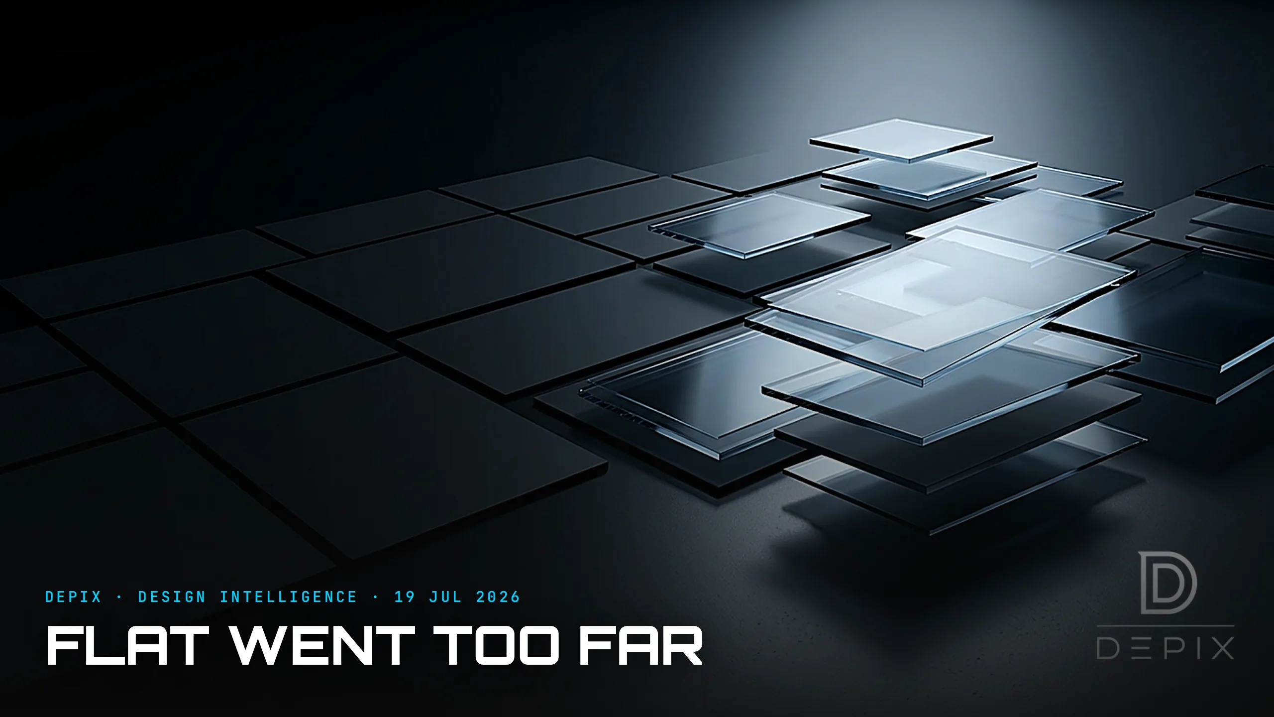
Flat Went Too Far: Why Depth Is Coming Back to the Screen
For most of the last decade, "flat design" was treated as the moment digital design grew up. We threw out skeuomorphism — the fake leather, the green felt of the game centre, the glossy 3D buttons — and embraced clean, flat, honest surfaces. Apple's iOS 7 in 2013 made it the global default, and for years, flat was simply what modern looked like. But flat design quietly broke something important, and the industry is now, visibly, walking it back.
To see what broke, you have to understand what skeuomorphism was actually for. It wasn't only decoration. A digital notepad drawn with paper texture and lined pages, a button rendered with a highlight and a drop shadow — these were doing a job called affordance: visually signalling how a thing behaves. The shadow said "this is raised, you can press it." The texture said "this works like paper." Skeuomorphism, for all its excess, aligned tightly with affordance theory — it told you what to do.
Flat design threw the affordances out with the ornament. When you remove shadows, edges, gradients and texture, you also remove the cues that separate a button from a label, an interactive icon from a decorative one. The research is blunt: flat design reduces affordances, making it hard for users to tell interactive from static elements. Everyone has lived the result — tapping a piece of text that turned out not to be a link, or missing a button because it looked like a caption. Flat made screens beautiful and, too often, harder to use. That is why the debate was never really skeuomorphic versus flat; both extremes miss the actual point.
So depth is coming back — and not as nostalgia. The transitional step was neumorphism, which reintroduced soft shadows and subtle depth to restore affordance while keeping a clean, modern look. And in June 2025 Apple made the reversal official with Liquid Glass, its biggest visual overhaul in over a decade — a dynamic "material" that provides a genuine sense of depth and hierarchy between elements, with floating shadows and refracted light guiding the eye. It is a deliberate move away from the flat cues of iOS 7, and the whole industry is asking whether it is the next Material Design — Google having spent years arguing, through shadows and layers, that depth is information, not decoration.
But here is the crucial point, and it is where the pendulum framing usually fails: the answer is not "depth good, flat bad." Depth done carelessly recreates skeuomorphism's old sins — clutter, cognitive load — and worse. Liquid Glass has drawn immediate, serious criticism over legibility and accessibility: a refractive, translucent surface can look stunning and still fail a contrast ratio, making text hard to read for many users. Adding depth is exactly as easy to get wrong as removing it was.
Which is the whole lesson, and it is a concept-phase one. The goal of an interface's visual language was never a style — not flat, not skeuomorphic, not glass. It was communication: making it instantly obvious what is interactive, what is hierarchy, and how a thing will behave when you touch it. Flat, skeuomorphism and Liquid Glass are all just different vocabularies for saying that; the failure in each era came from treating the vocabulary as the point. You have to decide, up front, what your interface needs to communicate — affordance, hierarchy, state, feedback — and then choose the visual depth that serves it, in clarity, depth and motion that a user's perceptuomotor instincts already understand. You cannot paint "obviously tappable" onto a flat layout at the end, any more than you could sand the fake leather off a skeuomorphic one and call it clarity.
So enjoy the return of shadows and glass — but distrust the pendulum story. Flat wasn't a mistake and depth isn't a cure; each was an answer to the previous era's excess. The interfaces that will actually feel good to use won't be the flattest or the glassiest. They'll be the ones that decided, before the first pixel, that the only job of the surface is to tell you the truth about what's underneath it.
Sources:
- ●Liquid Glass: how Apple's design evolved from skeuomorphism to iOS 26 — AppleMagazine
- ●Skeuomorphism, flat design and neumorphism: the evolution of UI — Medium (P. Sharma)
- ●Revisiting digital interfaces: skeuomorphism, flat, neo-skeuomorphism (affordance) — RSIS Intl
- ●Skeuomorphic vs flat: where the trend is heading — Medium (A. M)
- ●Skeuomorphic vs flat design — Logovent
- ●Apple introduces a delightful and elegant new software design (Liquid Glass) — Apple
- ●Liquid Glass — Wikipedia
- ●Is Apple's Liquid Glass the next Material Design? — Telerik
- ●Liquid Glass: smart or bad for accessibility? — Designed for Humans
- ●Clarity, depth and motion: how Liquid Glass is reshaping UX/UI — Pixelbeard
- ●Smash the dichotomy of skeuomorphism and flat design (perceptuomotor) — ScienceDirect
Downsizing the Face: What the Grille Means Now That It Has Nothing to Cool

Matte Hides, Gloss Reveals: What a Finish Tells You About the Surface Underneath


