Flat: What Car Brands Gained and Lost When They Flattened Their Badges
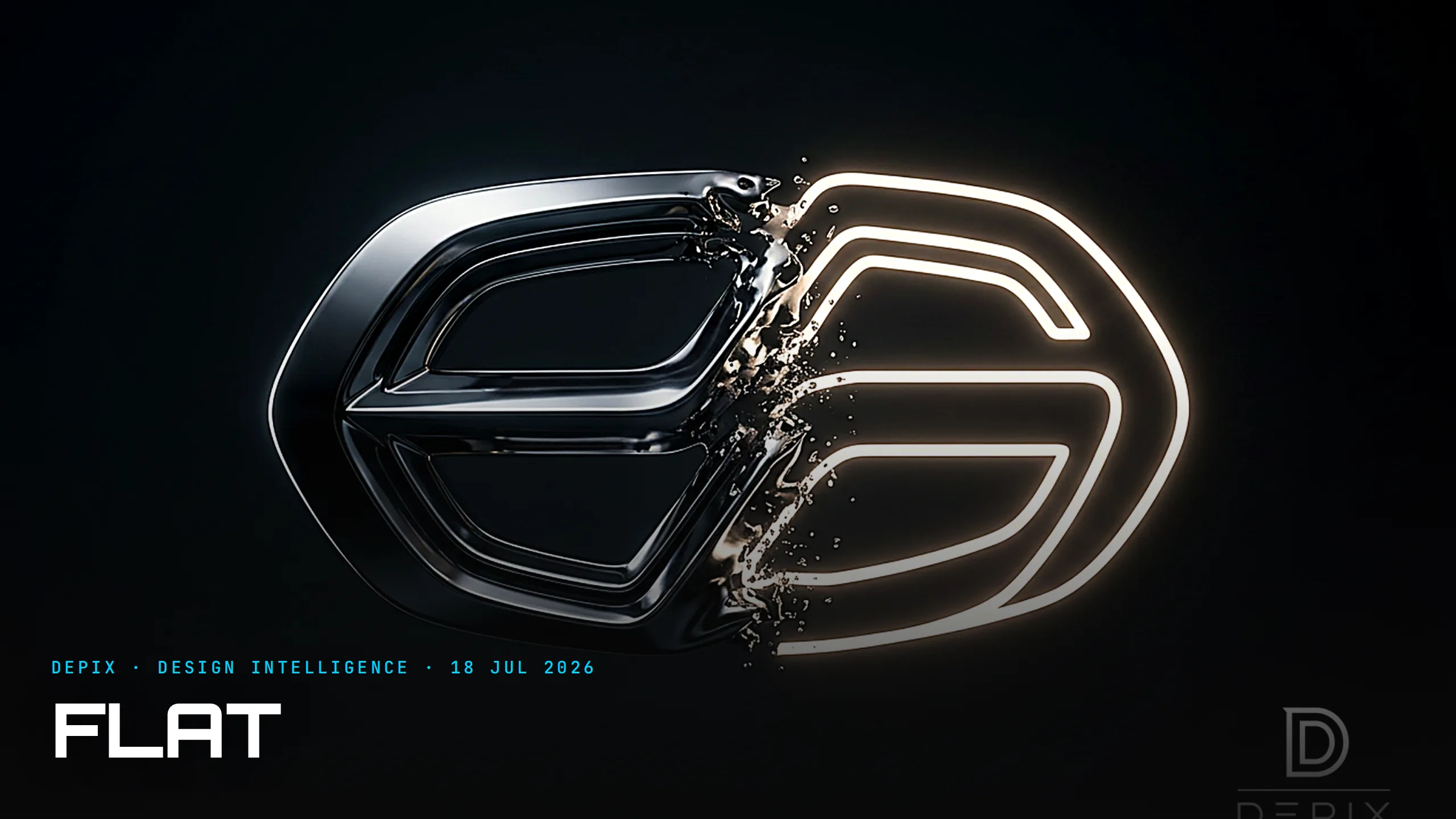
Line up the car badges of 2015 and 2025 and you notice something eerie: they have all gone flat. BMW shed the metallic depth of its roundel in 2020. Volkswagen thinned its monogram to a single line of dark blue in 2019, timed to its first electric ID.3. Nissan, Audi, Renault, Kia, Mini, Toyota and most recently Mazda have all followed — trading chrome, bevels and gradients for clean two-dimensional marks. It is the most synchronised design decision the industry has made in a decade, and it is worth asking what it bought and what it cost.
Start with why, because the flat wave was not a matter of taste — it was a change of habitat. For a century a car badge lived on metal: a grille, a bonnet, a steering-wheel boss. Its natural language was three-dimensional — polished, raised, catching light. But the badge's most-seen home is no longer the car. It is a phone screen: an app icon, a favicon, a configurator, a slide in a keynote. As Toyota's lead designer put it, all those fiddly bevels and gradients collapsed into "little grey smudges" at small sizes. A flat mark renders crisply at 32 pixels, animates cleanly in a boot-up sequence, and costs less to reproduce everywhere. Given where the logo now lives, flattening was the rational answer.
There is a second driver: electrification. A chunky metal emblem says heritage and horsepower; a clean 2D mark says software and future. Brands flattening their badges are making a positioning claim — that they belong to the new era — and doing it at the most concentrated point of their identity. Volkswagen deliberately launched its flat logo with the ID.3, not a facelifted Golf. The badge became the smallest, densest carrier of a very large message.
And yet. The criticism landed almost immediately, and it was not only reflexive nostalgia. Enthusiasts called the redesigns lazy and cheap and — more tellingly — indistinguishable. Strip a marque back to a thin, monochrome, geometric outline and you converge on the same visual language as everyone else; designers borrowed a word from fashion for it, "blanding". When the Audi rings lost their reflective metal, drivers said they looked "pasted on, as an afterthought." That is the cost: a premium badge exists partly to signal a made, engineered, three-dimensional object — the very depth that flattening removes. In optimising for the screen, a brand can lose the thing the emblem was for.
This is the concept-phase decision hiding inside a logo, and it is more consequential than it looks. A badge is the most-reproduced design a company will ever make: it appears at every scale from a favicon to the front of a building, in metal and in pixels, static and animated. Deciding its form is deciding how the brand reads in dozens of contexts at once — and, crucially, you cannot fully optimise for all of them with a single mark. The screen wants flat; the bonnet wants depth. Get that call wrong at the start and no amount of later marketing fixes a badge that reads cheap on the car or muddy on the phone.
Which is why the most interesting move is not flattening — it is the split. Smart brands increasingly run two versions of one identity: a flat, animatable digital mark for screens, and a sculptural, sometimes illuminated physical emblem for the car, where regulations now let the badge itself light up. BMW kept a dimensional badge on the metal while using the transparent flat one online. The identity did not get simpler; it got bi-modal — designed honestly for two habitats with opposite demands, rather than pretending one mark could serve both.
That is the real lesson beneath the trend. The flat wave looks like fashion, and partly it is; but underneath it is a genuine design-intelligence problem — where does this element actually live, and what does that place require? Answer it at the concept phase and you get an identity that is sharp on a screen and rich on a car. Answer it lazily and you get a grey smudge that is crisp everywhere and memorable nowhere. Plenty of brands are now rethinking the balance, and the ones that treat the logo as a system rather than a single picture will age best. The badge did not have to lose its soul to gain a screen — but only if someone decided, early, that it had to win in both worlds.
Sources:
- ●Dezeen — Seven car brands that have returned to flat logo designs
- ●Fast Company — Mazda's new mark is the latest car logo to go flat
- ●Formtrends — Transforming Logo Designs for the Electric Era
- ●Autocar India — Why is logo design going flat?
- ●HCG — Why So Many Car Brands Have a New Logo Design
- ●Creative Bloq — Car logo redesigns: the good, the bad and the ugly
- ●nss magazine — The flat logo trend is spreading in the automotive industry
- ●CarBuzz — The Real Reason Automakers Keep Reinventing Their Logos
- ●Jurni — Why are new car logos getting simpler?
- ●Aeternus — When Car Logos Had a Soul
- ●MadeByShape — Why are so many car brands simplifying their identities?
- ●Motor1 — Here's Every Automaker That Just Got a New Logo

The Spreadsheet vs the Studio: Who Really Designs the Car

The Floating Roof: How a Free Graphic Trick Ate Every Car