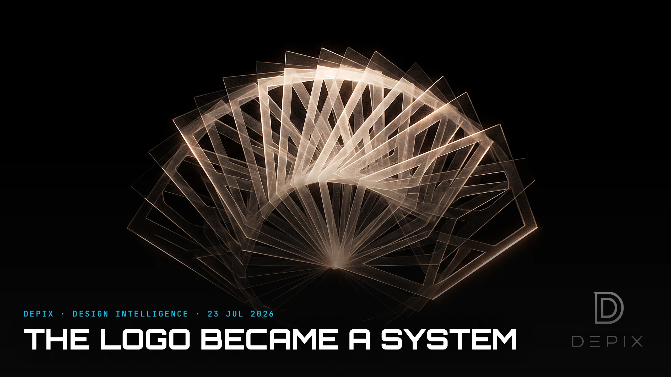
The Logo Became a System: Why the Best Identities Are Never the Same Twice
For almost all of design history, a logo was a fixed thing. One immutable mark, reproduced identically everywhere, forever. Consistency was the point — entire departments and 200-page guideline documents existed to stop anyone from altering it by a pixel. Then something strange happened: several of the most admired identities of the last fifteen years are ones that are never the same twice, and that is precisely why they work.
The MIT Media Lab's identity was an algorithm that generated over 40,000 permutations — a unique mark for every single person at the Lab, claimable and ownable, printed on your own business card. The Whitney Museum's responsive "W", by Experimental Jetset, is a single zigzag stroke that stretches to wrap around whatever text or image it sits beside, appearing in hundreds of different proportions — on tickets, on the website, even on the restroom signs. And right now, LA 2028 is unveiling an ever-shifting Olympic emblem whose "A" has more than 30 versions and counting, each drawn by a different athlete or artist — Billie Eilish, Reese Witherspoon, Chaz Bojórquez. The logo stopped being a noun and became a grammar.
It is tempting to read this as "let the logo be anything." It is the exact opposite. A variable identity forces you to design something far harder than a fixed mark: an explicit rule system, and underneath it, the single invariant that must survive every variation for the thing to still read as you. The Whitney's W is always one continuous stroke. MIT's forty thousand marks all share the same underlying skeleton. LA28's A always sits inside the same bold "LA" lockup. The freedom is the result of a rigid rule, not the absence of one — which is why the good ones are more disciplined than a static logo, not less.
This changes what you actually design at the concept phase. You are no longer drawing the artifact; you are authoring the generative rules and identifying the load-bearing DNA — the minimum set of constraints that makes anything recognisably yours. The decision moves from "what should the logo look like?" to "what is the smallest number of things that must always be true?" Too much freedom and the system dissolves into incoherence — it stops reading as one brand. Too little and there was no point being dynamic at all. Finding that line is the entire job, and it is a concept-phase decision: you cannot retrofit a coherent system onto a fixed logo after the fact.
There is a real failure mode here, and most dynamic identities fall into it: they move for novelty's sake. The mark flexes because flexing looks modern, but the variation carries no meaning — and that is worse than a good fixed logo, because you have paid for complexity and bought nothing. The identities that earn their motion have a reason for it. MIT's variation encodes a person; a live data-driven identity encodes weather or time; LA28's many hands encode participation and a city of many voices. So the sharp concept-phase question is never "should our logo move?" It is "does variation mean something here — and if it does, what is the invariant that holds all of it together?"
The pressure behind this is only growing. A brand now lives across a million screens, feeds and contexts it will never fully control, and increasingly its assets are generated on the fly, sometimes by a machine. In that world the fixed artifact is a losing unit to design. The actual deliverable becomes the system — the rules a hundred contributors, or an algorithm, can run and still land somewhere unmistakably yours. As the studio behind the Whitney mark understood, the designer's authorship moves upstream: you no longer draw the final mark, you author the constraints that make every future mark inevitably yours.
A fixed logo asks a simple question: what should we look like? A living identity asks a harder, more modern one: what must always be true about us, no matter who is drawing it or what it is wrapping around? Answer that at the concept phase and the system very nearly designs itself. Miss it, and no amount of motion will ever make the pieces feel like one brand.
Sources:
- ●MIT Media Lab logo by E Roon Kang and Richard The (40,000 permutations) — ICON Magazine
- ●MIT Media Lab identity (one adaptable dynamic mark) — Pentagram
- ●Pentagram's new dynamic, adaptable identity for the MIT Media Lab — media.mit.edu
- ●Whitney graphic identity — the 'responsive W' — Experimental Jetset (Dezeen)
- ●A New Graphic Identity for the Whitney — Whitney Museum
- ●MIT Media Lab identity — E Roon Kang (project page)
- ●The LA 2028 Olympics has unveiled an ever-shifting logo — Creative Review
- ●Meet LA's 35 different logos for the 2028 Olympic and Paralympic Games — Time Out
- ●LA reveals 32 logos (and counting) for 2028 Olympic and Paralympic Games — It's Nice That
- ●2028 Summer Olympics (LA28 dynamic emblem) — Wikipedia
- ●New Whitney Museum identity by Experimental Jetset — designboom
- ●Experimental Jetset — Wikipedia

You Can't Add a Fold Later: What Origami Engineering Teaches About the Concept Phase
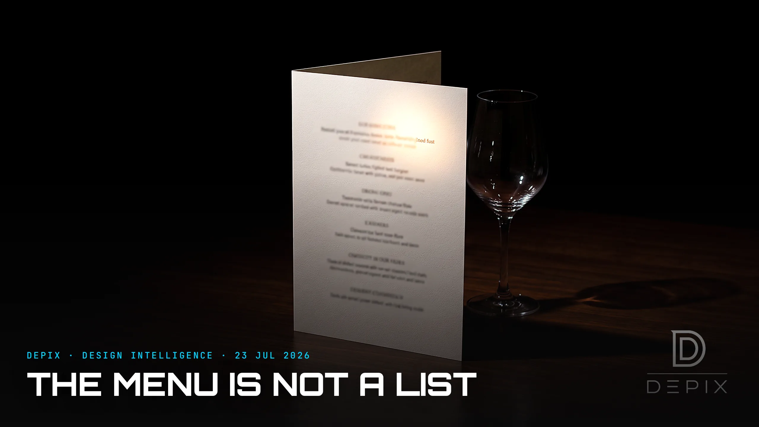
The Menu Is Not a List: The Most Persuasive Design You Never Notice

