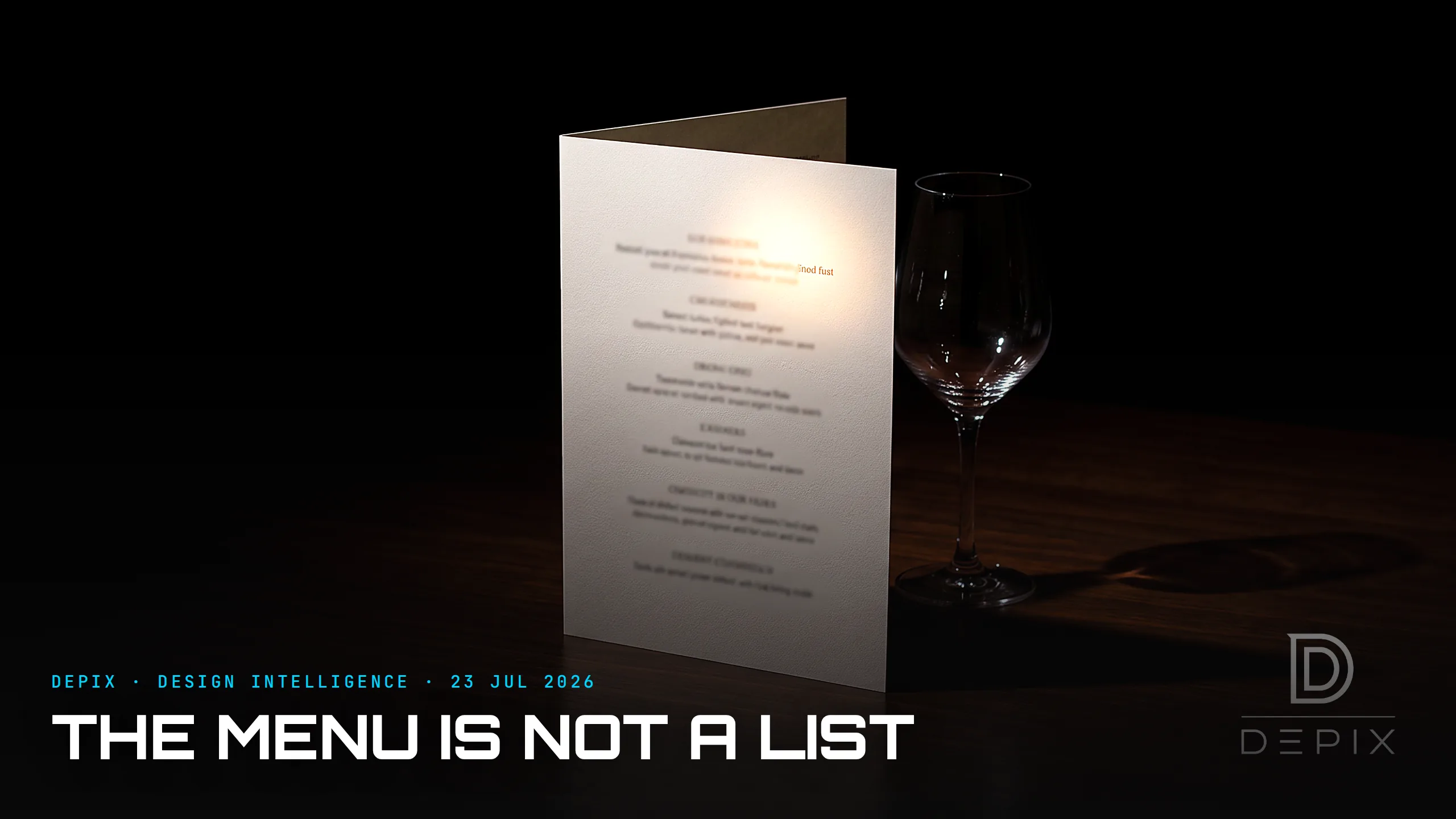
The Menu Is Not a List: The Most Persuasive Design You Never Notice
A restaurant menu looks like the most neutral document in the world: a list of what's available and what it costs. It is nothing of the sort. It is one of the most carefully engineered pieces of persuasion design you will interact with this week, and its entire job is to steer you — invisibly — toward what the restaurant most wants you to order. The discipline even has a name, menu engineering, and its tools are precise, researched, and hiding in plain sight.
Start with the words. Cornell research found that adding descriptive labels — "slow-roasted," "grandma's farmhouse" — lifts sales of a dish by around 27%, and, remarkably, makes diners rate the food as tasting better. The adjective does work the ingredient cannot. Then the price. Menus that print "24" instead of "$24.00" reliably raise spend, because the dollar sign itself triggers the "pain of paying" — drop the currency symbol and the number stops reading as money leaving your pocket. Then placement: eye-tracking studies show your gaze lands in a predictable "golden triangle" — the middle, then the top-right, then the top-left — so the highest-margin dishes go exactly there, not where the kitchen is proudest.
And then the quiet masterstroke: the decoy. A wildly expensive dish almost nobody buys is not a mistake — it is an anchor. The first big number you see resets your sense of "reasonable," so the second-most-expensive plate suddenly feels like sensible value, and the boxed "chef's special" beside it — the one they actually wanted to sell — looks like a bargain. Stack these moves and a restaurant can lift its average check by 15% or more without changing the food or raising a single listed price.
Here is the point that matters for anyone who designs anything. None of this appears on the menu. The diner sees a list; the designer built an instrument. The persuasion lives entirely in the structure — the hierarchy, the placement, the typography, the way a price is written — every bit of it decided before a single dish was described. The copywriting is downstream; the choice architecture is the concept-phase decision, and it governs the outcome far more than the prose ever will.
That is the deeper, uncomfortable lesson, and it reaches well past restaurants: the "neutral default" is never neutral. Every list has an order. Every layout has a first thing your eye hits. Every price has a presentation. Someone chose all of it — and choosing not to think about those things does not make them neutral, it just means they were decided by accident, or by whoever set the template. The same is true of a settings screen's pre-ticked box, a search result's ranking, a form's default option, a shop's "recommended for you." There is no version of presenting options that doesn't also, silently, shape which one gets picked. As the menu-psychology literature makes plain, the interface always has a thumb on the scale; the only question is whose.
The most powerful designs, in fact, are precisely the ones that do not look designed. A menu that announced "we have placed our most profitable dish in your line of sight and removed the dollar sign to dull your caution" would instantly fail — its power depends entirely on reading as an innocent list. That is a double-edged inheritance. The identical toolkit that upsells a steak can just as easily nudge you toward the lighter, cheaper, or more sustainable option, or make a genuinely confusing choice legible and calm. Choice architecture is not inherently manipulative. It is simply never absent — so the real decision a designer makes is whether to shape the defaults consciously and in the user's interest, or to pretend they are neutral and end up shaping them by neglect.
The menu, then, teaches the truth that sits under all interface design: you cannot present options without ordering them, and you cannot order them without deciding what people are most likely to choose. The list was never just a list. The only open question — decided upstream, at the concept phase, long before anyone reads it — is whether the person who built it knew exactly what they were doing, and whom it was built to serve.
Sources:
- ●The Psychology of Restaurant Menu Design (descriptive labels ~27%) — Toast
- ●The Psychology of Restaurant Menu Design (check +15%) — Aaron Allen & Associates
- ●Menu engineering: building a menu that sells (golden triangle, eye-tracking) — Popmenu
- ●The Science of Menu Design: 10 psychology tricks (dropping the dollar sign) — meez
- ●Menu Psychology: How Restaurants Influence Your Dining Choices (the decoy) — Neurolaunch
- ●How to use restaurant menu psychology to get more sales — WISK
- ●Restaurant Menu Psychology Principles That Drive Sales — MyDigiMenu
- ●Menu Hacks: The Psychology Behind Menu Design — Sweet Street
- ●Menu engineering — Wikipedia
- ●Decoy effect — Wikipedia
- ●Anchoring (cognitive bias) — Wikipedia)
- ●Choice architecture (Thaler & Sunstein) — Wikipedia
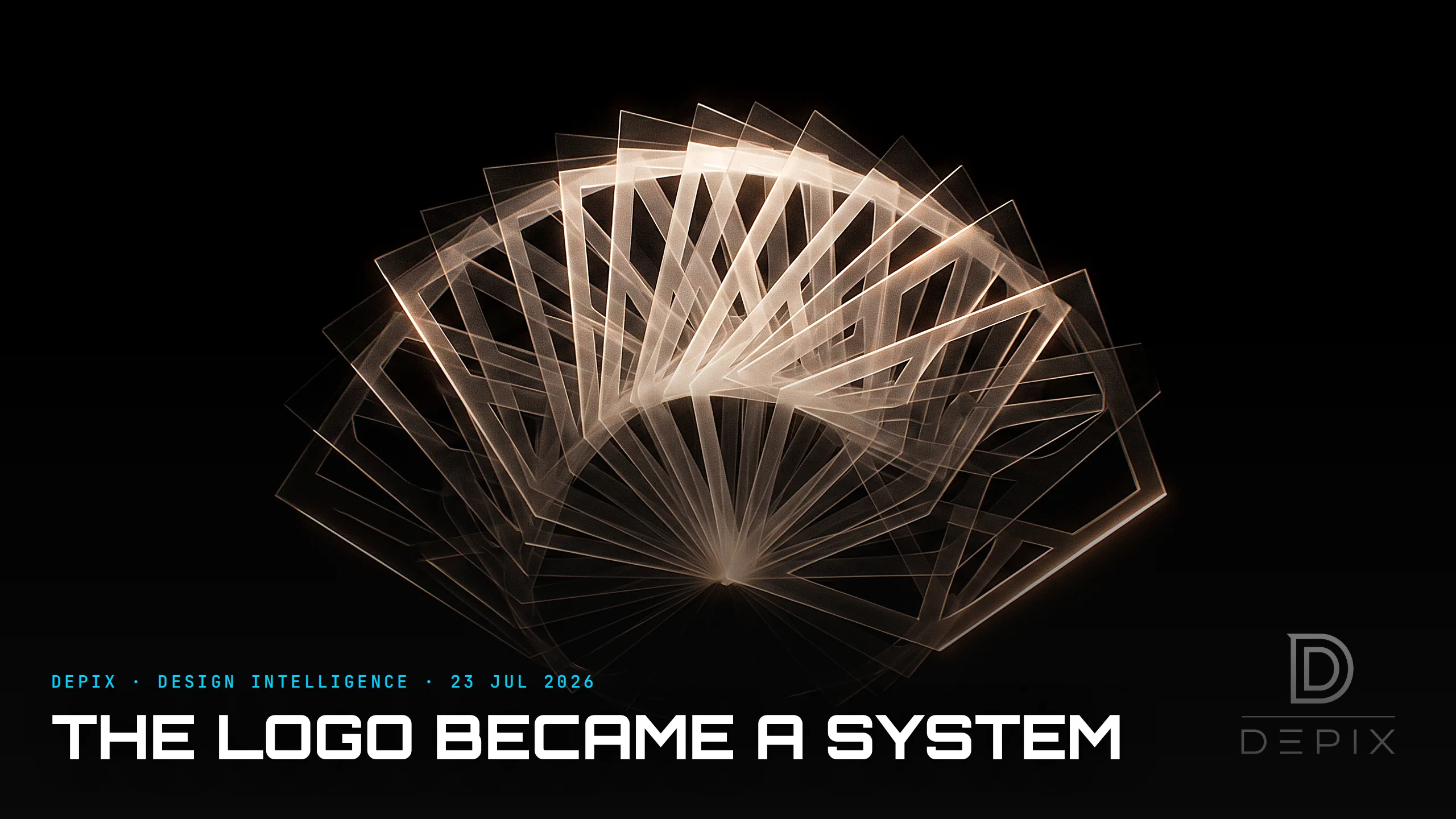
The Logo Became a System: Why the Best Identities Are Never the Same Twice

The Design Nobody Chose to Make: What the EU Tethered Bottle Cap Teaches
