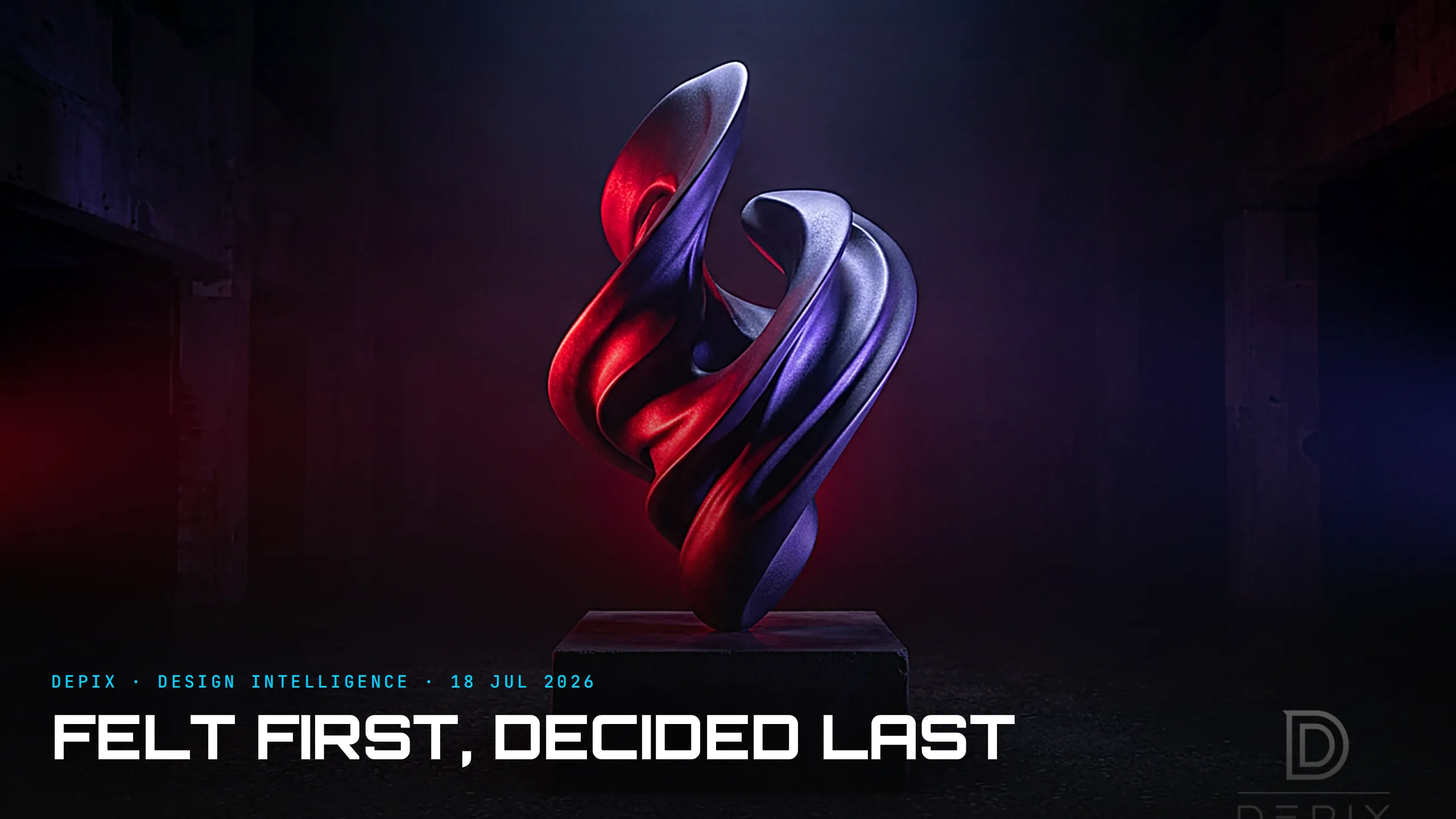
Felt First, Decided Last: What Colour Reveals About the Backwards Order of Design
Colour is the first thing you perceive about anything. Before your brain has resolved the shape, the function, the material or the brand, it has already registered the colour and started feeling something about it. It is the fastest, most direct emotional channel a designer has — studies of product marketing find that up to 90% of the snap judgments people make about a product can be based on colour alone. Colour is felt before the design is even understood.
And yet, almost everywhere, colour is decided last. It is the "colorway," the CMF pass, the shade chosen at the end to make a finished form "pop." The people who work in colour, material and finish will tell you it should be integrated from the very first stages of development — and then admit, in the same breath, that in practice it is a running conversation but not a devoted task until sometime toward the end. The single variable a human feels first is, by workflow, the variable decided last. That order is backwards, and it costs more than anyone notices.
Here is what colour is doing while it waits at the back of the queue. It is one of the first languages of branding, and a deeply emotional one — your audience may forget your entire brand story, but they will remember how you made them feel, and colour plays the lead in that memory. Colour psychology is the deliberate use of hue to elicit specific emotional reactions; it shapes mood, behaviour and decision-making; it can make a space feel warmer, a product feel more precious, a message feel urgent or calm, all before a single word is read. This is not decoration. It is the emotional register of the whole thing, set in an instant, by the one element most teams treat as a finishing touch.
Nothing makes the emotional weight of colour clearer than the strange annual ritual of the Pantone Color of the Year. It is not a prediction of what will look nice; it is a reading of collective mood — Pantone sifts cultural, political and social signals, lands on a colour family, then agonises over the exact shade and even its name. And the choice for 2026 is the tell of the decade: for the first time in the twenty-six years it has named a colour, Pantone chose white — "Cloud Dancer," described as a calming influence in a frenetic society, picked entirely for the feeling a culture is reaching for rather than for how it looks. That the choice was immediately criticised by some as tone-deaf only proves the point: a single colour is asked to carry an enormous emotional and cultural load, and everyone feels it instantly, whether they agree or not.
So the concept-phase argument writes itself. If colour is felt first and does this much emotional work, then the emotional register a design is aiming for — calm or urgent, warm or clinical, precious or playful — is a first-order decision, and colour is its most powerful instrument. That decision belongs at the very start, alongside the brief, before the form is drawn: what should this feel like the instant someone sees it? Get it right and the form has something to serve; get it wrong, or defer it to a late meeting, and you have built a beautiful object that happens to feel like nothing in particular, or like the wrong thing entirely.
The inversion most teams run is telling. The form is perfected in flat, neutral grey — precisely to keep colour from "distracting" from the "real" design — and only then is colour chosen, as if the feeling could be bolted on afterward without changing anything underneath. But the feeling is not a coat of paint. CMF significantly determines a product's perceived quality and identity, which means the choices of form and material should have been serving the intended emotion all along. Designing the shape first and the feeling last is like composing a melody in silence and picking the key at the end.
None of this argues for garish colour or for leading with a swatch. It argues for sequence. Decide the emotional target at the concept phase — name the feeling, choose the register, and let colour, form and material be shaped together to deliver it — rather than perfecting the object and hoping a good colourway supplies a soul at the finish line.
Deciding the feeling first, and treating colour as a primary instrument for it rather than a final flourish, is the part of design intelligence we care about most at Depix. The thing your design is felt as, in the first instant, was never meant to be the last decision you make.
Sources:
- ●Help Scout — The Psychology of Color in Marketing and Branding (up to 90% of snap judgments)
- ●Sprout Studios — How CMF Influences Consumer Behavior
- ●BangID — CMF in Product Design: Colour, Material, Finish
- ●Ignyte Brands — The Psychology of Color in Branding
- ●RMCAD — The Psychology of Color in Graphic Design
- ●iMotions — The Influence of Color on Human Behavior
- ●The Decision Lab — How Colors Affect the Way We Feel
- ●Pantone — Color of the Year 2026
- ●CNN — Pantone names its Color of the Year for 2026
- ●TIME — Pantone Chooses White ('Cloud Dancer') as Color of the Year for the First Time
- ●ARTnews — Pantone's 2026 Color of the Year, a Shade of White, Is Tone Deaf
- ●Lesmor Design — CMF x Design is Everything
Teaching Without a Tutorial: What Super Mario's First Level Reveals About Designing How People Learn
You're Designing the Light: Why the Object You Think You're Making Is Really an Instrument for Light