Design the Space, Not the Letter: What Variable Fonts Reveal About the Future of Every Design Decision
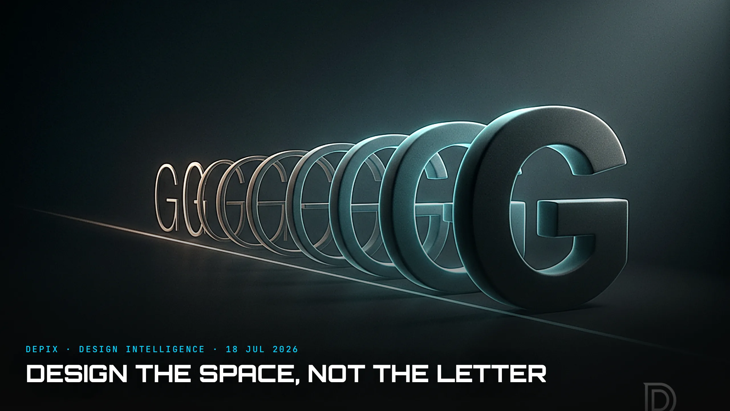
Open a font file in 2026 and you might not find a typeface at all. You might find a space. A variable font ships as a single file that spans weight, width, optical size and more — and inside it is not one design but a continuum of them, what type designers call a design space: a multi-dimensional field with an axis for each thing that can change. The designer defines the extremes; the software interpolates every point between. Ask for weight 550 and you get a letter no one ever drew by hand, generated on the fly from the boundaries someone set.
This began as a performance trick — one file instead of the six to twelve a brand used to ship — but it has become something far more interesting. Variable fonts are now the foundation of brand design systems, their axes treated as design tokens that define how a brand flexes across every context without losing itself. A logo can now literally be built as a variable font, its identity encoded not as a fixed mark but as a living range. Foundries like Dinamo and Frere-Jones increasingly ship the space, not the instance, and designers now work directly inside that continuum.
Here is why that matters far beyond typography. The variable font is the clearest example yet of a shift happening across all of design: the highest-leverage work is no longer crafting the individual output. It is authoring the system that generates all the outputs. A type designer working in a design space isn't drawing letters; they are deciding the rules by which infinite letters will be drawn — the axes that exist, the extremes that bound them, the way the middle interpolates. Get that space right and every instance inside it is automatically coherent. Get it wrong and no amount of hand-tuning any single letter can save the family.
That is a concept-phase decision in its purest form. The axes and the masters are chosen before a single production weight exists, and they determine everything downstream. It is the difference between designing a chair and designing the parametric rules that generate a whole range of chairs; between styling one screen and defining the tokens that make a thousand screens feel like one product. The instance is cheap. The space is the design.
And now the twist, because this is where 2026 gets genuinely interesting. Just as tools for generating instances become effortless — AI can produce a thousand plausible letterforms before lunch — the value flips back, hard, to the human who authored the space. When algorithms flood the world with flawless, generic flatness, the marks of a maker become the signal; hand-crafted typography has become a deliberate statement of human authorship. Anyone can generate variation. What is scarce — and what a variable font actually encodes — is a considered space: someone deciding what should vary, how far, and what must stay constant. The machine fills the continuum, but a human has to draw its edges, and that judgment is the whole game.
This is the part most people miss about generative design of any kind. A system that can produce infinite outputs does not remove the designer; it relocates them. It moves them upstream, from the instance to the space — from "draw this letter" to "define the field this letter lives in." The work gets harder and more valuable, not easier, because a badly-defined space generates infinite bad instances with perfect efficiency. As letters begin to breathe and flex, the discipline that matters is the one you cannot see in any single frame: the shape of the space itself.
For anyone who designs anything, the lesson is to notice which level you are working at. Are you polishing one output, or defining the rules that will generate all of them? The first is craft; the second is leverage. The variable font makes the choice unusually literal — a typeface that is not a set of letters but a set of decisions about how letters may vary — but the same choice hides in every design system, every product line, every brand.
Designing the space rather than the instance — defining the axes, the constraints and the extremes at the concept phase so everything generated within them coheres — is exactly the level of design intelligence we care about most at Depix. Get the space right, and the letters take care of themselves.
Sources:
- ●web.dev — Introduction to variable fonts on the web
- ●Alphabettes — Visualizing design space in variable fonts
- ●FontAlternatives — 2026 Typography Trend: Variable Fonts as Brand Systems
- ●dot2shape — Variable Fonts in Branding: Opportunities & Challenges 2026
- ●Creative Boom — A logo that is a literal embodiment of its brand values, built with variable fonts
- ●Dinamo — type foundry (Basel / Berlin / Porto)
- ●Frere-Jones Type
- ●variablefonts.io — Designing with Variable Fonts
- ●MadeGoodDesigns — Font Trends 2026: the type movements shaping design
- ●PixelRipple — Anti-AI Crafting: human-made design as competitive edge in 2026
- ●Creative Bloq — Breaking rules and bringing joy: top typography trends for 2026
- ●Medium (Bootcamp) — Typography Trends 2026–2027: When Letters Begin to Breathe
Nothing Is Given: What the First Commercial Space Stations Reveal About the Defaults You Design Around Every Day

The Sound Is Designed Too: What Silent EVs Reveal About the Surface Everyone Forgets