The Colour of the Concept
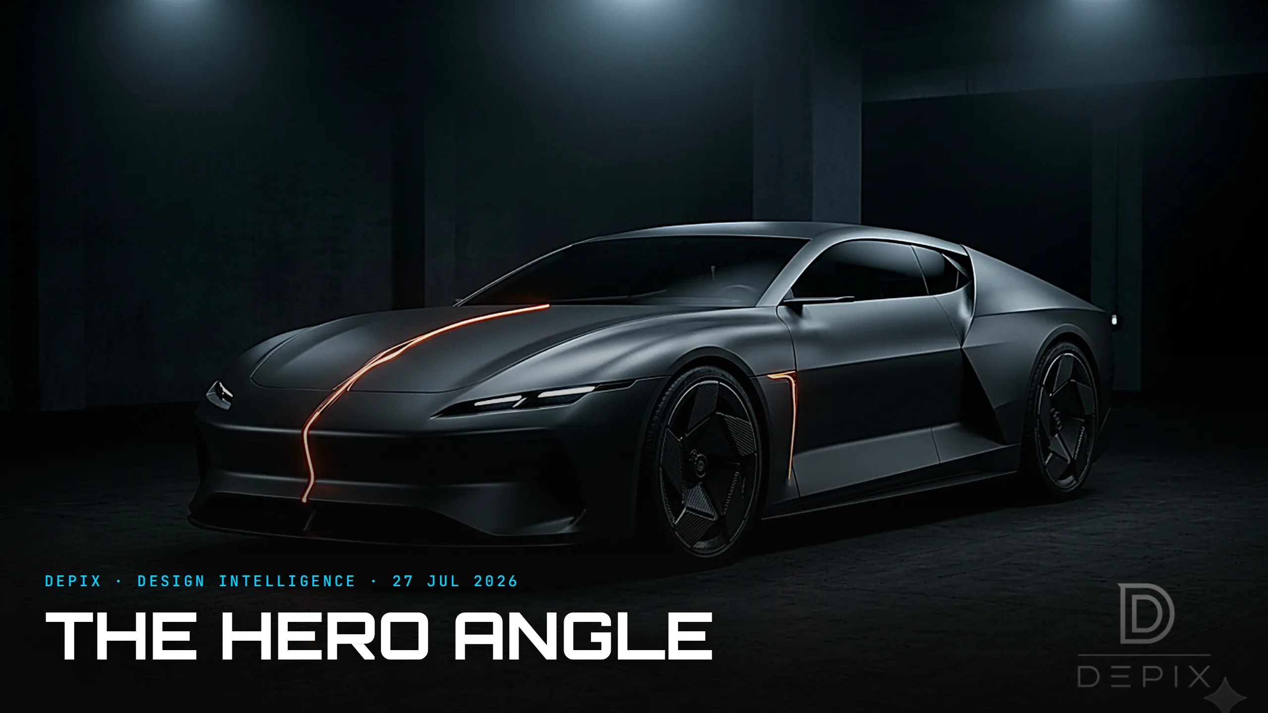
Look at almost any concept car, design render or reveal image and you will notice the same thing: it is finished in matte grey, silver or near-black, with at most a single accent line. This is so universal it reads as neutral, as no choice at all. It is, in fact, a very deliberate choice — one made at the concept phase for good reasons, which has quietly hardened into a trap.
Start with why the studio reaches for grey. Silver is the first colour a design team tries because it is neutral and lets you examine the highlights — the bright reflected lines that travel across a surface and tell you, better than anything else, whether the sculpture is any good. Design studios light their clay models with rows of fluorescent tubes for exactly this reason: to read the reflections. Saturated colour fights that reading; it seduces the eye with hue and hides the truth of the form. So neutral grey is not an absence of decision — it is a precision instrument for judging shape, proportion and surface before anything else is committed. Clay models are deliberately kept neutral so the colour-and-materials decision stays open until the form is resolved.
Grey also says something. A concept in raw silver or matte graphite reads as serious, engineering-grade, form-first — not yet a product, still an argument about shape. It signals "judge the sculpture, not the paint." That is a legitimate and powerful rhetorical move, and it is why our own study images at Depix run near-dark with a single accent: at the concept phase, we are asking you to read the form.
Here is the contrarian turn. This studio convention has escaped the studio, in two directions, and both are worth watching. The first is cultural: the grey leaked onto real roads. The grayscale palette now dominates actual car sales, a genuinely strange collapse of colour on our streets that has designers and critics asking why cars got so relentlessly bland. Some of it is resale-value caution — the "clay-coloured car" is the safe financial choice — and some of it is simply that the form-reading grey of the design studio became aspirational, a signal of taste. Shades like magnetic and nardo grey went from studio tool to showroom fashion. The instrument became the style.
The second direction is the one that matters for design intelligence. The seductive grey render flatters the form while quietly deferring the colour-and-material decision — and colour is not a garnish, it is a real, load-bearing design choice with its own emotional and commercial weight. When every concept is the same moody graphite, the reveal tells you almost nothing about how the car will actually live in the world: in white under a grey sky, in red in daylight, wrapped in the reflections of a real street. The render is honest about the sculpture and silent about the chroma. And because the grey image is so beautiful, teams and audiences alike can mistake a resolved form for a resolved car — in a market already accused of looking alike, that is a dangerous thing to let slide.
So the discipline is to hold two truths at once. Grey is the right tool for reading a surface — the highlight-revealing neutral that lets you judge the sculpture — and it is the wrong tool for pretending the colour question has been answered. The best teams use the neutral to interrogate the form and then, separately and deliberately, make the CMF decision, rather than letting the gorgeous grey render stand in for a choice no one has actually made. The colour you present in is itself a decision — about whether you want the viewer judging the form or the product — and it should be made on purpose, not inherited from convention. Even silver metallic, the default, is a specific choice with specific effects, not a neutral non-answer.
At Depix, this is exactly the kind of quiet convention we exist to make visible: know whether your grey is revealing the sculpture or hiding an unmade decision. The colour of the concept is never really no colour. It is an argument about what you want judged — and, like every argument, it should be made deliberately, at the phase where changing it is still free.
Sources:
- ●How clay car models really work — The Autopian
- ●Why grayscale and neutral colours dominate — Carvana
- ●Why aren't cars as colourful as they used to be? — Monday Economist
- ●Fifty shades of gray: America's obsession with bland car colours — CarBuzz
- ●You can thank rich folks for all the clay-coloured cars — Jalopnik
- ●Why magnetic gray car paint is taking over — Auto Paint HQ
- ●Passionate about car colours — Gulf News
- ●Design differentiation and the EV sameness problem — The Truth About Cars
- ●Vellum Venom: a glossary of automotive design terms (highlights) — Hagerty
- ●Metallic silver car colour guide — Alibaba