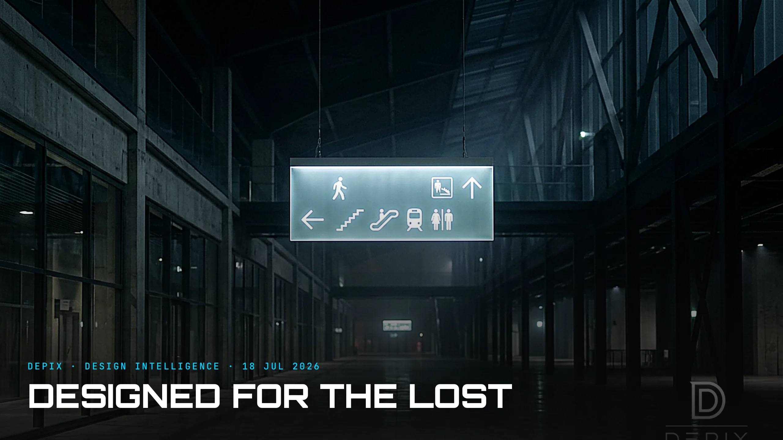
Designed for the Lost: What Wayfinding Reveals About the User You Secretly Assume
Think about the last time you were properly lost — an unfamiliar airport with a tight connection, or a hospital trying to find a ward while someone you love is in surgery. You were not calm. You were not reading carefully. Stress narrows attention: as cortisol rises, the brain filters out peripheral cues, so a stressed person walks straight past a large sign they would normally notice — and struggles to hold more than one direction in working memory. That person, at their worst, is exactly who wayfinding is designed for.
This makes wayfinding one of the strangest and most instructive disciplines in design, because it is almost the only one that openly designs for a user in a degraded state. Hospital visitors are anxious, sleep-deprived, navigating unfamiliar territory under emotional distress. Airport passengers are rushed, jet-lagged, and often do not speak the local language, so they lean on universal symbols instead of words. Wayfinding does not get to assume an attentive, motivated, expert user. It assumes the opposite — the worst-case cognitive state — and builds everything from there.
That single assumption is the whole design. Because you are designing for someone who cannot spare much attention, you strip information to the minimum and favour graphics and simple symbols over dense text to lower the cognitive load at every decision point — studies of airport guidance find that text-only signage raises cognitive load and lowers decision confidence, while text-plus-graphic improves both. You place a sign exactly where the question forms in the person's mind, not where it is architecturally convenient. Every choice flows from one upstream decision about who the user is and what state they are in.
The classics prove it. When New York needed to make its subway legible to strangers, Massimo Vignelli and Bob Noorda built a standardised system on Helvetica set to a fixed grid, with colour bands for the lines — a graphics standards manual so rigorous it is now a design landmark, precisely because it removed decisions from the stressed traveller and made them once, centrally, forever. Frank Pick's London Underground roundel was designed to act as a beacon — no reading required, just a shape you lock onto from across a concourse. Legible London rebuilt the city's pedestrian signage around how a confused person actually thinks on the street. None of these were decorated into clarity afterward. They were designed, from the first decision, for someone who is not paying attention.
Here is the contrarian part, and the reason wayfinding is worth studying even if you never design a sign. The best wayfinding is measured by absence. You have succeeded when the traveller never stops, never doubles back, never feels the small spike of panic of being lost — when they arrive without ever consciously noticing your work at all. It is a discipline whose highest achievement is its own invisibility, and invisibility of that kind is only possible if you assumed the degraded user from the very first sketch. You cannot retrofit robustness onto a system built for an ideal user; the assumption has to be baked into the architecture.
Which points at the quiet decision underneath all design, not just signage. Every designer assumes a user — their attention, their competence, their emotional state, their patience — and most do it unconsciously, defaulting to a user suspiciously similar to themselves: calm, expert, motivated, giving the thing full attention. That assumption is a concept-phase decision, usually invisible, and it silently determines everything. Design for the ideal attentive user and you build something that shines in the demo and fails exactly when the real person is stressed, distracted or new. Universal-design wayfinding makes the opposite bet: design for the person having the worst day, and the thing becomes robust for everyone, including the calm expert on a good day.
That is the transferable lesson. Whether it is an airport that must work for every passenger, a complex hospital campus, a piece of software, a form or a product — the most consequential thing you decide is the state you assume your user is in. Assume the best and you optimise for the demo. Assume the person is lost, rushed and only half-looking, and you design something that holds up in the real world, where good wayfinding is a genuine act of care.
Deciding, honestly and early, who your user really is — not the flattering version who resembles you, but the stressed, distracted, real one — is the part of design intelligence we care about most at Depix. Design for the lost, and you take care of everyone.
Sources:
- ●Designer Daily — Wayfinding in Hospitals: Designing for Stress and Clarity
- ●MOA Architecture — The Importance of Wayfinding in Healthcare Design
- ●Erie Custom Signs — Airport Signs and Symbols Explained
- ●ScienceDirect — Improving wayfinding in hospitals for people with diverse needs
- ●Tandfonline — Airport visual guidance systems and passenger wayfinding performance
- ●New York Transit Museum — Vignelli (subway signage & map)
- ●Slate — The NYC Transit Authority Graphics Standards Manual (Vignelli & Noorda)
- ●A.J. Wells — TfL's London Underground history & signage (the roundel)
- ●SEGD — Legible London
- ●TravelWayfinding — What is Universal Design in Wayfinding
- ●Selbert Perkins Design — Analog & Digital Wayfinding is Key to Airport Success
- ●Miller EG Design — Wayfinding for Complex Environments: Hospitals, Airports, Campuses
- ●Mappedin — Wayfinding Signage: Best Practices & Examples

Designed to Age: What Patina Reveals About the Decision the Render Never Shows

Designed to Open Slowly: What the Unboxing Reveals About Designing Time Itself