The Tetra Pak Won on a Number Nobody at the Store Can See
Pour a glass of milk and look at what it came in. The carton is one of the most successful objects ever manufactured — hundreds of billions are made a year — and almost nobody has ever chosen a product because of it. That is not a failure of the design. It is the entire point. The Tetra Pak won a competition the shopper cannot even see.
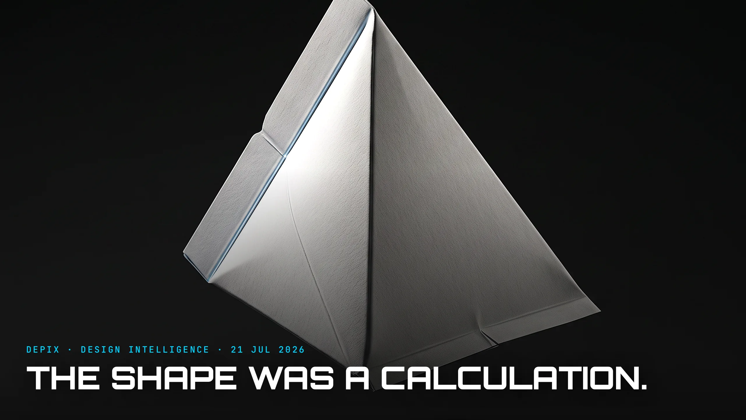
Start with the shape, because the shape is a confession. When Erik Wallenberg sketched the first package in the Åkerlund & Rausing lab in 1944, he didn't reach for a tetrahedron because pyramids look nice on a table. He reached for it because a tetrahedron can be formed from a single continuous tube of paper with almost no waste — a technician named Erik Magnusson later worked out that you could fold and seal it at ninety-degree angles straight off a roll, filling and closing the package in one continuous motion. The geometry wasn't styled. It was calculated. It fell directly out of a single principle the founder, Ruben Rausing, drilled into the company: a package should save more than it costs.
That sentence is the whole design brief, and it points at a metric no customer will ever read: cost-per-litre-delivered. Not how the carton looks on a shelf, not how it feels in the hand — how cheaply it can be made, filled and moved compared with the glass bottle it replaced. MoMA now holds the original Tetra Classic as a design landmark, but it earned its place in the world on a spreadsheet, not a plinth.
Then came the move that redesigned an entire industry. In 1961 Tetra Pak launched aseptic packaging: milk sealed so cleanly it could sit on a warm shelf for months without refrigeration. That wasn't a nicer carton — it deleted the cold chain. No refrigerated trucks, no daily delivery, no chilled warehouse. The package quietly rewrote dairy logistics for half the planet, and again the winning attribute — shelf-life measured in months — is one the person buying it barely notices.
But here is the part designers should tattoo somewhere. The beautiful, material-efficient tetrahedron was a commercial problem. Pyramids do not stack. The very geometry that saved paper wasted space in every crate, truck and shelf, because irregular shapes leave air between them. Tetra Pak had optimised one invisible metric — material — and been ambushed by another: packing density. So they inverted their own icon. Under engineer Åke Gustafson they spent years turning the same roll-fed process into a plain rectangular brick, and the Tetra Brik launched in 1963. It is less elegant, less clever, and it won — because a box stacks and a pyramid doesn't.
That is the concept-phase lesson, and it's sharper than "form follows function." Every product is quietly graded on several metrics at once, and only some of them are visible. The Tetra Pak story is a sequence of choosing the right invisible number: material cost, then shelf-life, then packing density — each one decisive, none of them apparent to the shopper, and one of them (density) nearly missed even by the people who had already mastered the others. A team that optimises only the metric it can see — how the thing looks — is optimising the one that decides the least.
The trap is that the visible metric is seductive precisely because you can see it. Styling gives instant feedback; logistics doesn't. So teams pour the concept phase into the render and discover the real constraints — cost to ship, cost to make, months on a shelf — only after the tooling is cut and the numbers are fixed. The Tetra Pak worked because Rausing named the deciding metric first, in a single sentence, before anyone drew anything — and then had the discipline to keep re-checking which invisible number was now in charge.
You can see the same invisible-metric logic everywhere once you look for it. Flat-pack furniture is designed around cubic metres in a shipping container, not around how it photographs. The aluminium drinks can is a marvel of grams-of-metal-per-fill, not of silhouette. In each case the object you hold is the answer to a question asked in a warehouse, not a showroom — and the companies that lost were usually the ones still perfecting the showroom.
Look at the carton again. It is not humble and it is not plain. It is the visible residue of a series of ruthless, unglamorous calculations — a design that decided, on purpose, to win where no one was looking.
Sources:
- ●Wikipedia — Tetra Pak
- ●Wikipedia — Erik Wallenberg
- ●Wikipedia — Tetra Brik
- ●MoMA — Ruben Rausing & Erik Wallenberg, Tetra Classic (1943-44)
- ●Tetra Pak — Heritage (aseptic 1961, company history)
- ●Tetra Pak — Tetra Brik Aseptic
- ●Quartr — Tetra Pak: The Shape of Innovation
- ●Company Histories — Tetra Pak International SA
- ●PatentRenewal — Who Invented the Tetra Pak? History and Patents
- ●Bright Maize — Ruben Rausing, Founder of Tetra Pak
- ●The Fat Pitch — History: Tetra Pak

The Yellow Pencil Is Marketing. The Hexagon Is the Real Design.

Your Padlock Doesn't Work. It Was Never Supposed To.


