
Neutral by Mandate: Designing Money for a Continent That Can't Agree
Money is the most-handled, least-looked-at design object in the world, and the euro banknote is the hardest brief in it. A note has to satisfy constraints that openly contradict each other: it must be forgery-proof yet cheap to print at scale, legible to a machine and to a blind hand, durable for years of abuse — and, uniquely, it must represent twenty nations without visibly favouring a single one. That last constraint is not a styling preference. It is the whole problem, and the original designers solved it with one of the most radical concept-phase decisions in graphic design: they made the notes about nothing at all.
The bridges, windows and gateways on today's euro notes are deliberately fictional. They are architectural styles, not real structures — no French bridge, no German gate, no Italian window — precisely so that no country could claim the currency as its own. Neutrality was engineered by subtraction: strip out every specific reference until nothing is left to argue about. The result is a design so committed to representing everyone that it represents no one, and that was the point. The fiction was so deliberate that a Dutch designer, Robin Stam, eventually built the imaginary bridges for real in the town of Spijkenisse — the abstraction made concrete as a joke about how carefully it avoided being anything.
This is the opposite of everything brand design teaches. A brand is told to be distinctive, ownable, unmistakable; the euro was told to be the reverse — generic on purpose, so a Greek and a Finn could each hold it without feeling it belonged more to the other. When you design for everyone, "meaningful" and "neutral" pull in opposite directions, and the euro's founders chose neutral. It is easy to read the bridges as a failure of imagination. They were the opposite: the correct answer to an almost impossible constraint.
Which is why the European Central Bank's redesign, now moving toward a decision, is so much more interesting than "new money." The ECB has shortlisted two themes: "European culture," featuring real Europeans such as Maria Callas and Marie Curie, and "Rivers and birds," depicting real species — a kingfisher, a white stork, a wallcreeper — against real landscapes. A Europe-wide design contest opened in 2025; the public will weigh in on shortlisted designs, and the ECB expects to choose in 2026. After a quarter-century of pointed abstraction, the notes are being asked to mean something.
And that is where the concept-phase decision reopens a problem the bridges were invented to close. The moment a note carries something specific, the old question returns in a new costume: whose? Put faces on the money and you must decide whose Europeans count — a choice that is cultural, historical and unavoidably political, which is exactly why the European institutions, not individuals, sit on the safer reverse side. Choose rivers and birds and you have quietly picked which nations' nature stands in for the continent's, and which do not appear. Abstraction was never timidity; it was the mechanism that made twenty finance ministries able to agree. Trading it for meaning trades a solved design problem for a negotiation.
None of this means the redesign is wrong. Money that means nothing is easy to agree on and easy to feel nothing about, and there is a real argument that a shared currency should carry a shared story rather than a shared void. The greener, more durable new series is a chance to decide what that story is. But the decision that matters is not which illustration wins the public vote. It is the one upstream of the vote: how much specificity a shared identity can bear before it stops being shared. That is a concept-phase question, and it will be answered — consciously or not — the instant the ECB commits to a theme, long before a single designer draws a bird.
The lesson travels well beyond currency. Every identity built for a broad, divided audience faces the same fork: be distinctive and risk excluding, or be neutral and risk meaning nothing. Most brands resolve it by default, drifting toward whichever feels safer that quarter. The euro is about to resolve it on purpose, in public, for 350 million people — which makes it the clearest live demonstration you will get of a decision every designer eventually has to make, and almost no one names out loud.
Sources:
- ●ECB — Selection of the design for future euro banknotes
- ●Wikipedia — Euro banknotes (fictional bridges and windows)
- ●The Guardian — Dutch town builds the euro's fictional bridges
- ●Deutsche Bundesbank — ECB selects motifs for future euro banknotes
- ●Euronews — Rivers, birds, culture: ECB selects motifs for new euro banknotes
- ●Greek City Times — ECB unveils proposed motifs (European culture / rivers and birds)
- ●Banque de France — ECB selects motifs for future euro banknotes
- ●Frankfurt Main Finance — The future euro banknotes: selected motifs
- ●Croatian National Bank (HNB) — ECB selects motifs for future euro banknotes
- ●GreenMe — Euro banknotes are getting a makeover (more sustainable notes)
- ●Euro Weekly News — New euro banknotes are coming in 2026

A Good Flag Is What Survives Being Small
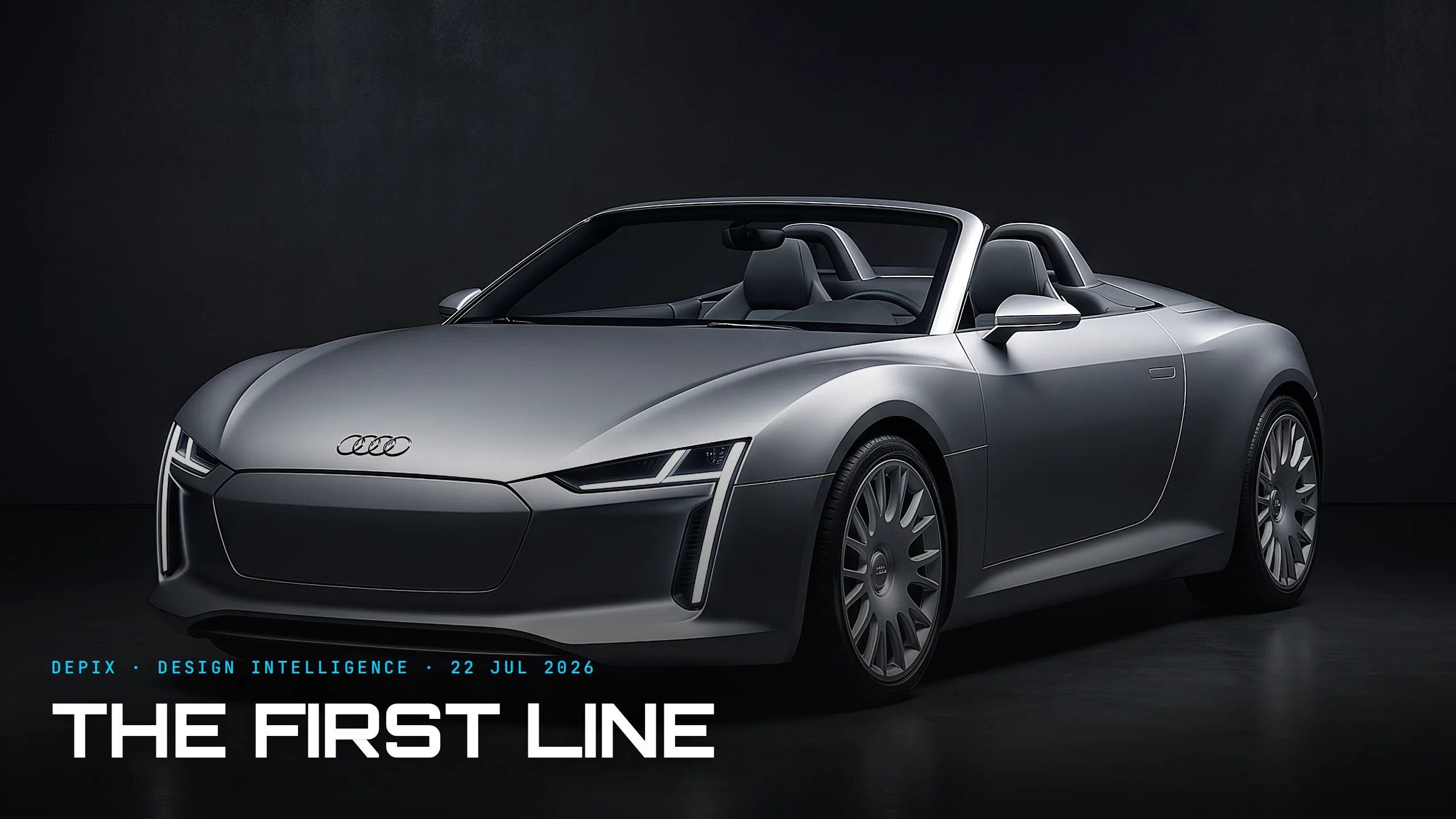
The First Line: Audi's Concept C and the Design Language a Decade Inherits
